Project | Travel Album: Project Life Modern Core Kit
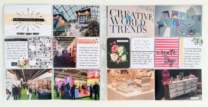
The Frankfurt Creativeworld travel album is moving along! This final layout of the Creativeworld 2014 show is using the Project Life Modern Core Kit, a feminine kit with lots of bold colors.
[Disclosure: This site is a participant in the Amazon.com affiliate program. Some links in this article are affiliate links that pay this site a commission when a purchase is made after a click.]
Supplies:
Project Life Modern Core Kit: Scrapbook.com & Amazon
Simple Stories Sunshine & Happiness Stickers: Scrapbook.com & Amazon
Pink Paislee C'est La Vie stickers: Scrapbook.com & Amazon
Tim Holtz idea-ology Words Remnant Rubs: Scrapbook.com & Amazon
Tim Holtz idea-ology Life Quotes Remnant Rubs: Scrapbook.com & Amazon
Tim Holtz idea-ology Gilded Holiday Remnant Rubs
Heidi Swapp Photo Frames
Dymo Organizer Express: Amazon
Heidi Swapp Memory Planner Clear Pop butterflies: Scrapbook.com & Amazon
Faber-Castell Pitt Artist Pen Black-S: Scrapbook.com & Amazon
The Project Life Modern Core Kit is a flowery kit doesn't exactly scream "travel". But not everything we do when we travel is suitable for a heavy travel theme. Sometimes we need to think outside the box (or core kit?) to find something that works for a specific activity. The Modern core kit worked nicely for my photos of trends at the Creativeworld and Christmasworld shows.
The photos on the left page are very brightly colored and busy. Because of this I kept the colors and designs of the cards muted to avoid it being too busy. Shades of pale pink and peach draw from the photos without competing with them.
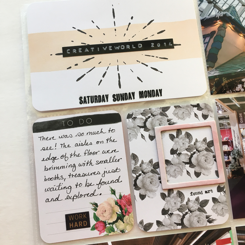
For my page title, I pulled out my trusty Dymo Organizer Express to create a custom piece of text to add to the card. And then I added rub-ons to the card to show the days that I was at the show.
I loved the journaling card with the black & white roses pattern but wanted to add another dimension to it. I settled on highlighting part of the design with the frame, and giving it a caption with a rub-on. This added another layer without overwhelming the softness of the card's pattern that I loved. It also gave the eye a focal point on a very busy card.
The journaling card about Christmasworld was a relatively plain pink card with a "thoughts" caption. A gold holly rub-on added a touch of Christmas theming without seeming out of place alongside all of the pink and floral elements on the page.
Some of my favorite elements in the Project Life Modern core kit are the bold graphic and floral elements. They need to be used sparingly however, to avoid drowning out the photos. On this layout I was able to get two of them in on the right page. Plus there was a small one of the bright flowers on the left page. It was important to spread these bright spots out to create balance in the layout.
I can't get enough of use these small text stickers on my Project Life layouts! Several companies make them and they always seem to find their way into my layouts. They are just right for adding a little extra something to my cards, like I did here on the floral card. The white sticker really pops off of the black background!
These clear Heidi Swapp butterflies have been in my stash for several years and every so often one of them is just what I need to add a little something to a project. I like adding dimension to my Project Life, but this side of the layout was totally flat. Adding the butterfly balanced out the dimension of the frame on the left side.
Don't forget to look beyond your "travel" supplies when creating travel projects! You may be surprised what you can create!
Check out the rest of the album so far:


