Project | Travel Album: Going Places
In my usual efficient (not) scrappy way, I am finally getting around to putting together a travel album for the trip that I took in January to Germany for the CreativeWorld trade show. It's a daunting task, since I took about 900 photos over 7 days (two of which were travel days spent on planes, of course).
[Disclosure: This site is a participant in the Amazon.com affiliate program. Some links in this article are affiliate links that pay this site a commission when a purchase is made after a click.]
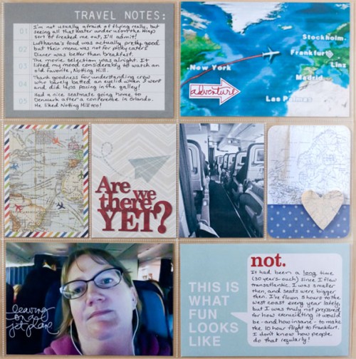
With that many photos, and the speed at which I create (molasses) I know the only hope I have of getting all of them in an album is to use a Project Life type pocket scrapbook. I'm starting the album by creating my first page, a layout about my prep and flight over. Later, when the album is complete and I see what it ends up looking like, I'll make a title page for it that ties together the style of the whole thing.
I bought several kits of journal cards to use in the album because I have a lot of different types of photos to scrap: ultra modern convention center, historic tourist pictures, and random travel stuff. For this starter layout, I primarily used the very graphic designs of the Urban Traveler collection by Simple Stories, but there are also several other designs worked in as well.
I went a bit crazy with the maps on this one. There's four cards that have map themes all together: the title block, the photo of the in-flight map, the rainbow bordered 3x4, and the heart 3x4 card. Then there's also a small piece of map - a faux washi sticker - on the card with my dinner picture as well. I'll probably try to carry the map theme through the rest of the album as much as I can. I adore map prints!
The layout is actually chronological from left to right, starting with the invitation to attend the show on the left under the title block and ending with the too long plane ride on the right. I'm not normally a big journaler in my layouts but this one I had a lot to say, details to record about the trip and my thoughts about it.
Supplies:
Simple Stories Urban Traveler 6x6 paper pad
Simple Stories Urban Traveler 4x6 SNAP Cards
Simple Stories Urban Traveler 3x4 journal card sheet
Simple Stories Urban Traveler Cardstock Stickers - Fundamentals
Simple Stories Urban Traveler Cardstock Stickers - Expressions
Kaisercraft Captured Moments - 4x6 Take Off Cards
Project Life Themed Card Pack (Travel)
Technique Tuesday 3x4 story cards - Observations by Ali Edwards (Gray)
Heidi Swapp 12x12 Paper Pad (No Limits)
Bazzill Smooth Cardstock (White, Walnut Cream)
Technique Tuesday stamps - Explore Arrows by Ali Edwards
Elle's Studio stamps - Saltwater Summer Happiness
Stamper's Anonymous stamps - Tim Holtz Mini Blueprints 3 stamps
Close To My Heart "Sightseer" stamps
Ranger Tim Holtz Distress Ink (Fired Brick, Black Soot)
Clearsnap Colorbox Mixed Media Inx (Pewter)
Tsukineko Staz-On Ink (Stone Gray)
Close To My Heart Washi Tape (Gray Polka Dot)
Tim Holtz idea-ology Remnant Rubs (Life Quotes, Words)
Silhouette Digital Cut File: Are We There Yet by Jamie Koay
Silhouette Digital Cut File: Going Places by Simple Stories
Silhouette Digital Cut File: Newsflash Polaroids by Simple Stories
Silhouette Digital Cut File: Heart Map by Glitz Design
"I heart travel" brushes by Ali Edwards for Designer Digitals
Instagram
Adobe Photoshop CC
Adobe Lightroom 5
I put that supply list as a bulleted list (instead of my usual paragraph) for a reason: to show how long it is! And note that several of those bullet points actually include multiple items. I have not historically been a product-heavy scrapbooker. The last single page 12x12 layout that I posted included about a quarter that number of supplies.
There's a perception that pocket scrapbooking destroys product sales because "all you need is a card set and pen and you can make an album". My experience, as reflected in the supply list above, is the exact opposite. I am finding myself using more products when I am pocket scrapbooking. A closer look at the two sides of the spread shows why.
The title card I made myself using a die cut from my Silhouette machine, along with a piece of 6x6 paper (Urban Traveler) and a piece of washi tape. Originally, I only intended to use the paper and the die cut. Then I sat there staring at it for a long time, feeling like it needed a little something more. That "something more" turned out to be the stripe of washi tape to ground the title die cut. The same thing happened on the next card over - I intended to use only the background paper and the printout from my instagram profile. But the instagram text looked lost in the big space - the washi tape sticker (more Urban Traveler) solved that as well. Something more!
The very nature of having so many pockets can increase a supply list if the scrapbooker likes to mix & match their cards instead of being uniform in design. With 8 pockets on this side of the layout, I have drawn from 4 card sets, a 6x6 paper pad, a 12x12 paper pad, and a 12x12 cut-out sheet as the basis for my cards. (The other side of the layout is not quite so extreme, drawing from two card packs, a 6x6 pad, and then my photos as the pockets' foundations.)
I used the same paper from the Heidi Swapp paper pad to cut both die cuts on this page (the title text and the instagram frame for my cake). I did this to give the color some repeat and because it was just a good dark neutral that I liked.
Three of my pre-made cards that I used above were enhanced with stamps for various reasons - because I thought they needed more detail, because I wanted to add a theme or message, or because I wanted to fill white space. I did a lot of stamping on this layout and it reminded me again of the benefits of having a large collection of inks and stamps, convenient to grab from when you need "something more." Updating my already huge stamp collection to get more stamps for working with in the rest of this album is now on my shopping list for my next online order!
There's teeny details that you can barely see in the frame around my passport photo (click on the photo to enlarge it). There was two slots for information and I used rub-ons to fill them so the card wouldn't look "unfinished." A small detail to be sure, but one that would have bugged me if I hadn't taken care of it. As it happened, Tim Holtz's remnant rubs were the perfect size and font to use too!
The two red text elements on this page kind of create a visual trick with the text. The "not" is supposed to be an answer to the "This is what fun looks like" statement on the blue card's design. But because the "not" is the same shade of red as the other text element " Are we there yet?" it looks like it also is an answer to that question. It's a not-so-hidden double message.
I used a lot of pre-designed cards, but I really wanted to use that "are we there yet" die cut because it so accurately reflected my attitude on my flight. I couldn't match it to a pre-designed card that made me happy so that meant I needed to make my own. I put together the patterned paper and die cut but it had a lot of white space left. You guessed it - it needed "something more!" So I dug out the Close To My Heart Sightseer stamp set and found the fun paper airplane, which is about how fast it felt like we were getting there!
The blue polka dot card would have been fine the way it came out of the package but it felt like too much white space to me. Something more! My solution was a map element layered on top of another map element. (Yes, I went a little nuts with the maps on this one.) The heart is a Silhouette print and cut file printed on clear sticker paper, and then stuck onto Bazzill Walnut Cream smooth cardstock to add a creamy touch to it. I then adhered it with adhesive foam dots so that it would have separation from the map element behind it.
I turned the photo of the airplane's aisle black & white in Lightroom because I was struggling with getting the color right in the photo. It was an iPhone photo shot in very poor light and the color was just too skewed for me to get it right, plus the colors in the scene - even if I were to get them right - didn't work with the shades of blue and red dominating the layout. Turning it black & white solved that, and it also gave a bit of a bleak look to what was my view for the flight.
The bottom line is that "something more" sent me diving into my supplies over and over...and before I knew it, I'd used an awful lot of them! That last level of detail added a lot of supplies to my list. From a retail or product promotion standpoint, that moves product. But I will also say that from a creative standpoint, it was fussing over those last details that I think I may have enjoyed most. It was the little finishing touches that made me say "aha" and feel like I had created something really personal.
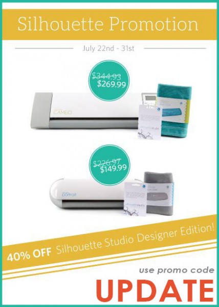
Once again, my Silhouette Portrait machine was essential to creating another one of my projects! Silhouette is running a great promotion right now on machine bundles that come with the Silhouette Studio Designer Edition software, as well as a cover - everything you need to get started creating! And if you already have a machine, they are also offering a huge discount on just the Silhouette Studio Designer Edition software, which lets you cut SVG files, and convert files to rhinestone or sketch output. There's also some extra knife, eraser and ruler tools that make creating easier and more productive with your machine!
Don't forget to use promo code UPDATE when you click here to get the great deals below!
These are great beginner bundles on the Cameo and Portrait machines - if you are thinking of buying a machine don't miss them! Click on the graphic above and use code UPDATE at checkout!


