
Project | Travel Album: Hello There, Frankfurt
It feels so great to be finally getting my memories of my Frankfurt trip from January into a travel album! And I'm really enjoying the process. I am realizing that until now I have just actually been dabbling in pocket scrapbooking. This album is getting me really intimate with it, and I am developing a process and a flow - and a comfort with it - that I've never had before.
I had a certain amount of time and photos that I wanted to cover in this spread, and to do that I ended up inserting an additional protector in the center. I cut down a Project Life Design F protector by cutting it vertically down the center to create the extra center flap. This gave me just the right additional pockets that I needed, and it's a trick that I've used before very successfully.
Instead of the travel stuff in my stash, for this section I turned to two completely different Project Life kits: Midnight and Clementine. Midnight, of course, is all black, gray, white and yellow - very bold and graphic. Clementine on the other hand is pink and gray and yellow and turquoise, very pale and pretty in comparison. How on earth do you combine those two?
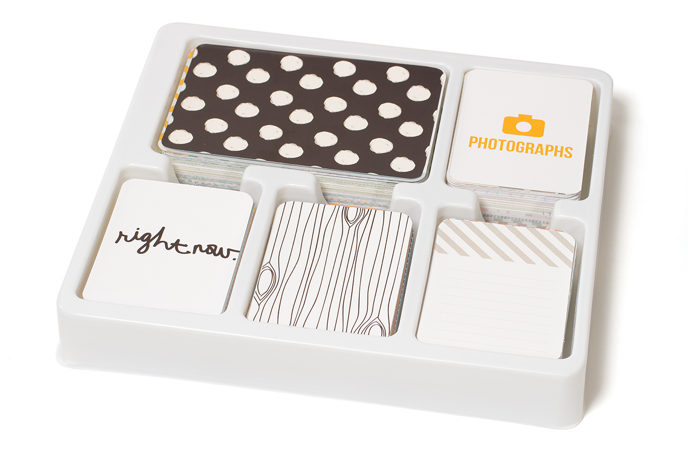
ProjectLife Midnight Core Kit

Project Life Clementine core kit
The key to combining these two kits (or any set of kits) is to find what they have in common and use it as a springboard to tie them together. In this case, these two kits share a common set of colors: yellow, grey, black, and white. They also share a common polka dot pattern. Then next I chose certain colors from out of the Clementine palette to serve as accents. Eventually I settled on the pale shade of turquoise and the pale pink.
So here's the result!
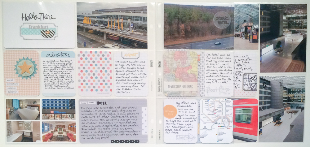
Frankfurt Project Life layout
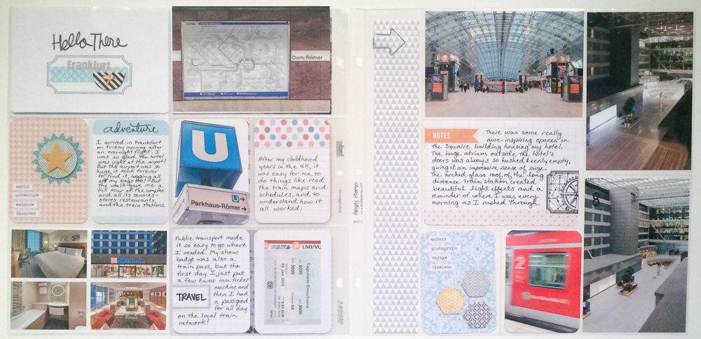
Frankfurt Project Life part 2
The full supply list, like the last one, is long! I'm developing a system of laying down the foundation cards and then putting layers on top of them until I decide I am happy and I stop. This means that the supply list gets long as I use tons of different stamp sets and inks and tiny sticker accents.
Supplies:
Project Life Core Kits (Midnight, Clementine)
Project Life Themed Cards (Travel)
Page Protectors: Project Life (Design A, Design F), Simple Stories
Patterned Paper: Bella Blvd Daily Chevies (Bell Pepper)
Vellum: Silhouette
Stickers: Tim Holtz idea-ology (Chit Chat), Fancy Pants Designs (Park Bench Fundamentals), My Mind's Eye Collectable (Remarkable Layered), Martha Stewart for Avery
Punches: Fiskars (large circle squeeze), Project Life (corner punch)
Stamps: Technique Tuesday (Observant Traveler by Ali Edwards, Beautiful by Ali Edwards), Stamper's Anonymous (Mini Blueprints #3 by Tim Holtz, Postcards by Tim Holtz)
Ink: Close to My Heart (Creme Brulee), Ranger Archival (Jet Black), Tsukineko Staz On (Jet Black), Colorbox Mixed Media Inx (Pewter)
Embellishments: Fancy Pants Designs Button Set (Me-ology), Close to My Heart Irresistables (Hexagons), Freckled Fawn (arrow paperclips)
Washi Tape: Teresa Collins (Memorabilia), Smash (black polkadot)
Baker's Twine: Doodlebug Designs Doodle Twine (Brights Assortment)
Let's take a closer look at the two sides of the layout!
Left Page with Left Overleaf
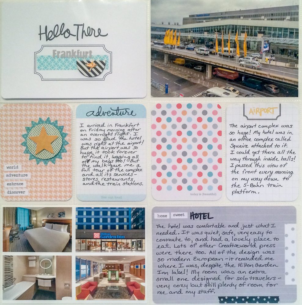
I knew as soon as I saw the "Hello There" title card that it was going to be my title! But the gray letter stickers wouldn't fill the whole box so I needed some filler. As the design of the page developed, so did the design of the card. The Teresa Collins washi tape grounded the letter stickers while taking up space horizontally (and adding some color). The chipboard button from Fancy Pants' new Me-ology line was the perfect bold touch to finish it off.
I only had two photos on this section of the layout and both were rather blah in tone. The addition of the hotel photos helped brighten it up. Since I failed to take any photos of my hotel or room (major scrapbooking fail), I created a collage in Lightroom of official pictures from the hotel's website. Not as personal but it got the job done. One other "photo" element that I added was a screen capture of a train map from my favorite iPhone app that I used in Frankfurt.
Left Page Solo
After picking my photo elements, then I decided what space to fill with journal cards. (I actually did both sides of the layout at once, which was surprisingly complicated, but am writing about them one at a time). I knew I wanted a large card to write about the hotel, one to set the scene for my arrival, one about the airport photo, one about the landscape photo, and one about the train app. The rest could then be filler cards. After determining what I needed where, then I set about choosing what the cards should be.
The polka dot card and map card were chosen very early on, along with the blue journal card. Then I started building around them. Color balance is very important to me so I juggled card designs around trying to make sure that I didn't have too much of one color or two much of another. Same thing with pattern. At one point the page was an explosion of polka dots before I fixed it to tone it down and replace some with other patterns. Eeek. I like to have my colors and patterns recur across a layout like this, but there is a line that you cross where it becomes too repetitive.
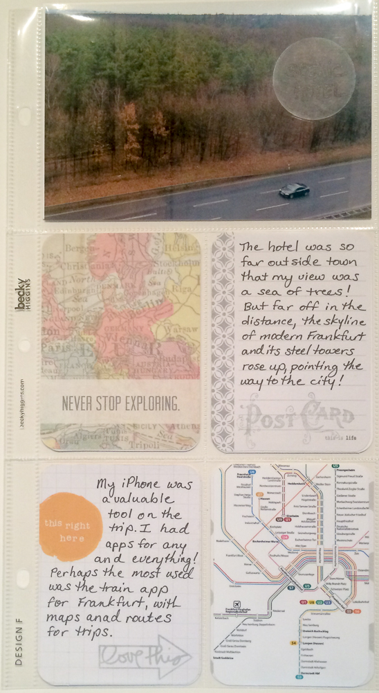
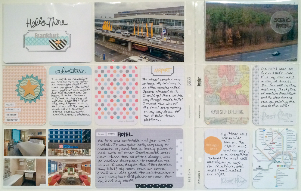
Left Overleaf Solo
I absolutely love digging through my stamp sets for the perfect word or image to put in an empty spot. I went nuts with the stamps on this layout. On the added page, I did several stamped elements in the Pewter ink because it is light and so the elements are there but not heavily visually. Also, Tim Holtz's "Chit Chat" stickers got a real workout on this layout.
I tried to liven up the boring landscape photo with a vellum circle that has "scenic hotel" stamped on it. The circle adds interest but also leads the eye to where the key element of the photo is...the tiny towers of the Frankfurt skyline far off in the distance.

Right Page with Right Overleaf
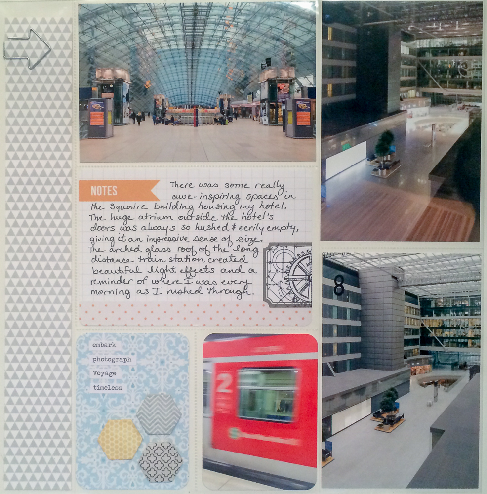
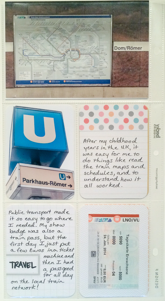
The second side of the layout is my favorite I think, simply because it probably contains some of my favorite photos from Frankfurt. And it has a cool piece of memorabilia on it - my train card from the day I arrived. This section of the photos all have to do with trains, except for the two vertical ones that are here because that is where I was able to get in the big pockets for them (plus they are part of a building that is a train station, so it works).
This side was a bit difficult to color balance because of the strong color in a few pictures. I kept the pattern in the large strip very soft, using a Bella Blvd Daily Chevies design in a pale gray. Two of the three journaling cards have only light pops of color, and then the third one has the brighter polka dot pattern. I used that card (which is actually a frankenstein created by cutting a designed card and layering it over a blank lined card) and the blue patterned card to bring in some color.
Right Page Solo
I used a Martha Stewart for Avery label and a Tim Holtz Blueprints stamp set to create a custom embellishment for the large journaling card. The blue patterned journaling card is also custom, being created from scratch using Close To My Heart Irresistibles. I selected the colors and patterns that I wanted to create a card that is a great pop but not overwhelming.
I knew the long border needed something more than just the patterned paper, but I didn't want a huge design to overwhelm the rest of the page. I finally settled on an arrow paperclip that leads the eye from the left to the right, and visually connects the train map picture to the train station picture.
Right Overleaf Solo
The entire insert section of the layout was all about the train system. I absolutely love the convenience and experience of the European train systems, and have since I first experienced it when I was a child living in the UK. There is just something I find magical about it that I can't explain. As the album goes on, there will be lots more pictures from trains and of trains!
I can't wait to get started on the next section of this album, which will be about my visit to the historic area of Frankfurt!