Telling A Story With A Must-Scrap Picture
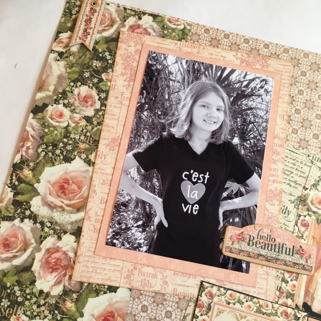
Every so often one of these pictures comes along that you know you just must scrapbook. For me, this relatively ordinary looking image of my daughter is one of those pictures. There's a story behind this snapshot!
[Disclosure: Graphic 45 provided some of the product that was used in this layout, and my company is the social media manager for 28 Lilac Lane's manufacturer. This site is a participant in the Amazon.com affiliate program. Some links in this article are affiliate links that pay this site a commission when a purchase is made after a click.]
Our daughter has always had really long hair. But recently, it had become very dry due to her medical treatments. Her hair being so dry led to really nasty tangles that were virtually impossible to get out, especially since one of her autistic sensitivities is having her hair brushed. Many battles were fought and tears shed. We finally decided that long hair was not worth the trouble and reluctantly took her for a haircut.
We weren't prepared for the result...our little girl grew up right before our eyes in just a few minutes! She adores what she calls her "Taylor Swift hair" and there's no more tears when it comes time to do her hair!
A couple of days later, I had her model a t-shirt for me that I'd made for a website project. My normally awkward and shy in front of the camera child flashed a rock star smile and posed like a pro. Where did this grown-up kid come from?
I've been dying for a reason to use this Portrait of a Lady collection that Graphic 45 sent to me, and this seemed the perfect reason! It's even covered in roses, and Rose is my daughter's middle name. The pink on the t-shirt was a bit bright for this collection, but since this image isn't about the t-shirt, I just printed the photo in black & white. Problem solved!
Supplies:
Graphic 45 "Portrait of a Lady" 12x12 paper pad: Scrapbook.com & Amazon
Graphic 45 "Portrait of a Lady" 12x12 patterns & solids: Scrapbook.com & Amazon
Graphic 45 "Portrait of a Lady" Journaling Chipboard: Scrapbook.com & Amazon
Graphic 45 "Portrait of a Lady" Decorative Chipboard: Scrapbook.com & Amazon
Ranger Tim Holtz Distress Ink in Peeled Paint: Scrapbook.com & Amazon
Ranger Tim Holtz Distress Ink in Antique Linen: Scrapbook.com, & Amazon
Sakura Pigma Micron 03 pen: Scrapbook.com & Amazon
brads
embroidery floss
28 Lilac Lane "Attic Findings" embellishment kit: Scrapbook.com & Amazon.com
Scrapbook Adhesives by 3L red liner tape: Amazon
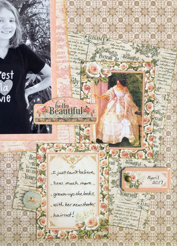
Patterns like the large roses are gorgeous but can be visually overwhelming. I prefer to use them in small doses, like this vertical strip that takes up 1/3 of my layout. The roses are carried over to the right side of the layout in the borders of the two cards that I used on that side, to create balance.
The secret to layering visually busy papers is to create the pattern version of contrast. Layer a pattern with a light base over a pattern with a dark base (such as the pink text paper in the photo mat being layered over the rose pattern). Or layer a more open pattern over a more dense pattern (such as the green text paper that is over the tan background pattern). And of course you can layer different sizes of patterns to create visual contrast, as well.
To enhance the visual divide between busy patterned papers, I like to ink my paper edges. Sometimes I just barely run an ink pad along the white edge of the paper to darken it. Other times, such as on the photo mat on this layout, I shade more in from the edges to create more of an edge.
What's your favorite trick for working with busy patterned papers?


