Scrapbook Soup | Instagram Layouts, Part 2 [Giveaway]
And we're back with the second part of my up close and personal look at my layouts from my Instagram segment for the new season of Scrapbook Soup!
[Disclosure: Some links in this article are affiliate links that pay this site a commission when a purchase is made after a click.]
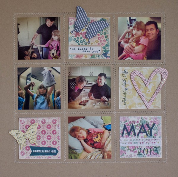
Since Instagrams are square, they lend themselves perfectly to making grids. Before stitching, I measured and drew my grid very lightly in pencil. When I was done stitching, I erased with a white eraser in any areas where the pencil line was too dark and was visible through the zig-zag stitch.
For this grid layout, I combined an assortment of photos from the entire month. It provides a good overview of the high points of our month for May. There's my birthday, our family time on my husband's weekend visits, my daughter giving thumbs down in the dressing room to something while going birthday shopping for her...
I filled the leftover empty spaces in the grid with vignettes that I created (with the exception of the title block) with a recipe of patterned paper, a text element, and a chipboard element. All the major elements are from collections - the patterned paper is all from a Maggie Holmes paper pad, and the chipboard is from the Color Magic collection by Heidi Swapp. Each element also has some Recollections pearls added to tie them all together as well.
The edges of the patterned paper blocks are edged in white paint with a dry brush technique that I used a make-up sponge to apply. It softens the harsh line of the grid and ties the white stitching to the blocks a bit. It also mimics the vignetting on the edges of most of the Instagram pictures.
The label next to the big blue butterfly is from Martha Stewart's line for Avery, which is a Staples exclusive. I have a big basket of those labels in my drawer right next to me when I'm working and I use them a lot!
Instagram Grid Layout by Nancy Nally for Scrapbook Soup season three
Supplies:
Bazzill Basics 12x12 Cardstock (Kraft)
Sewing Machine & White Thread
Maggie Holmes for Crate Paper 12x12 paper pad
My Mind’s Eye “Kate & Co” - Cambridge Court 6x6 pad
Ranger Inkssentials stamping paper
Kelly Purkey stamp - Happiness...
Technique Tuesday Stamps - Simple Joy by Ali Edwards
Elle’s Studio stamps - Serendipity
Hero Arts “Make A Date” stamp set
Close To My Heart Inks in Blush & Buttercup
Donna Salazar Mixed Media Ink by Colorbox in Denim
Stampin’ Up Classic Stampin’ Pad in Midnight Muse
Martha Stewart for Plaid Satin Acrylic Paint in Wedding Cake (white)
Recollections Self-Adhesive Pearls
Martha Stewart for Avery labels (Staples exclusive)
Heidi Swapp Color Magic Chipboard Embellishments - Hearts, Butterflies
Bella Blvd Blue High Five Alphabet stickers
Recollections self-adhesive lace on a roll
My second layout is all about food. I normally am not a huge picture taker when it comes to food, but when my husband started coming home on visits and cooking, that was an event that I couldn't resist taking pictures of!
The cork frames are cut from a Polaroid frame die by Lawn Fawn, but they take on a whole different aesthetic cut from the cork material.
This golden yellow is normally not a color that I would ever use - it's just one of those colors that for whatever reason I really don't like. We all have those, right? Well this is one of mine! But with the color tone of the food and the Instagram filters, I just couldn't avoid admitting as I was constructing this page that this really was the best choice for the project. I tried to keep my color choices very natural, in keeping with food, which is why there is a lot of earth and neutral tones in this project.
I've never been one for heavily themed layouts. I like lighter touches for my themes, which is why things like the doily and the fork are perfect elements for me on this layout. They provide the gentle suggestion of a food theme without screaming "THIS IS A FOOD LAYOUT."
Scale is important on this layout. The doily extends about 2/3 of the way across the page. The words on the title also extend about 2/3 of the way across the text block from each side. Any bigger or smaller and those elements would have been out of balance.
Supplies:
12” x12” Bazzill Cardstock in Yukon Gold
8.5” x 11” Bazzill Cardstock in Smooth White
8.5” x 11” Bazzill Cardstock in (unknown green)
Heidi Swapp “Sugar Chic” 12” x 12” paper collection
Recollections by Michaels Self-Adhesive Cork Sheets
Lawn Fawn “Schoolhouse Backdrops” stamps
Lawn Fawn “Say Cheese” die
Ranger Tim Holtz Distress Ink in Scattered Straw
Ranger Tim Holtz Distress Ink in Brushed Corduroy
Georgia Font
Rochester Font
7 Gypsies Cutlery in Antique Silver
Wilton 8” Doilies
Sakura Pigma Micron 03 pen in Black
Xyron 510 machine
And now for the giveaway! Thanks to Lawn Fawn, you can win the stamp set that I used to make my journaling lines on the Home Cooking layout above. It's called Schoolhouse Backdrops, and as you can see from my layout, is useful for way more than ABC layouts! The ledger and notebook lines, especially, have endless uses!
How To Enter: All you have to do to have a chance to be the lucky winner is leave a comment on this entry before 11:59PM U.S. eastern on Monday night, October 14th, 2013. Make sure you include your email address in the line reserved for it on the comment form (for your own protection, don’t put it in the text of the comment, where it will be visible to the public – just in the line labeled “email” in the form where only I can see it). We will need it to notify you if you are a winner. Winner will be drawn by random drawing from all eligible entries. One entry per person. Only U.S. mailing addresses are eligible due to shipping costs.


