Pinterest Inspiration | Linens
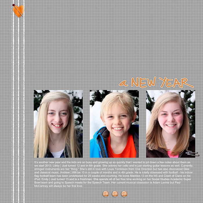
When it comes to design, I am always drawn to clean lines and uncluttered layouts. When I stumbled upon these linens on Pinterest, I absolutely fell in love with them. Unfortunately, they are from the Netherlands so I probably won't be purchasing them but I was inspired enough by them to make a scrapbook layout based on their colors and design.
linens ad
These beautiful towels are from the Dutch shop, Ottomania. I love the texture of the linen fabric and the simple stripes making their way down the left side of each towel in this photo. I also really like the assortment of cool colors in different combinations of blue, white, gray and taupe. The simple, classic design feels crisp and fresh.
All Supplies from Designer Digitals | Patterned Paper: Shades of Gray No. 01 Paper Pack by Cathy Zielske. White Line Brushes: Pencil Lines Journalers Brushes and Stamps No. 01 by Katie Pertiet. Word Art: Happy New Years Brushes and Stamps by Ali Edwards. Embellishments: Color My Love Element Pack (felt heart), Color Study Flair: Orange No. 01 (orange epoxy), and Maybe Tomorrow Kit (staples) by Katie Pertiet. Absolutely Acrylic: Hearts No. 02 (glass head pin) by Pattie Knox.
Gray and white are one of my favorite color combinations and I decided to combine those two colors from the linens for my layout. I started with a piece of grid paper designed by Cathy Zielske. Her clean and simple style has always inspired me and her classic grids were perfect for this layout. I then layered textured pencil line brushes over the left side to mimic the lines in the inspiration photo. I placed my three photos towards the bottom of the page with journaling underneath them. Because my photos had bright colors in them, I wanted to bring in just a touch of color to the layout to add some balance to it. I didn't want to take away from the simplicity, though, so I added only a simple pin and orange heart to the top of the pencil lines and three small orange epoxies under my journaling. I decided to use an orange title to add a final touch of color to the layout.
This style could easily be adapted to a more layered, shabby design if you preferred by matting the photos and adding tags and embellishments. The beauty of being inspired by a simple photo is that you can make it your own in so many different ways.
I love spending time on Pinterest and I always find something to inspire me. I hope that you are inspired by this design as I was. Let me know where you find inspiration and maybe I’ll use it in a future column. You can also follow my Pinterest boards here.
-Stephanie Vetne


