Gallery Highlights | 5.25.2012
Welcome to this week's Gallery Highlights! We have an eclectic bunch of scrapbook projects for you this week - a gorgeous canvas, traditional layouts, multi-photo layouts, single-photo layouts and digi layouts. So, let’s go take a look! You can click on the links to visit the layouts in their galleries and view supply lists, leave a comment for the designer, or view the designer’s other work.
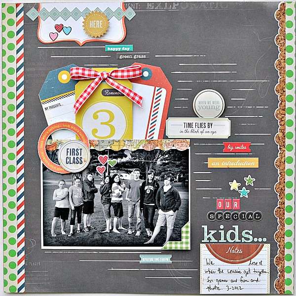
Our Special Kids! by Gumpgirl
This next layout is such a great example of how to use every inch of your page to create a great design, even if you only have one small photo. The designer used bright borders, fun embellishments, and tied them all together with the black & white photo by layering them on a dark neutral background. The result is gorgeous!

Hohensalzburg by Denise Gormish
Denise's layout struck me immediately when I saw it! This is such a perfect example of a quick way to put together a travel album. Denise kept the background simple and used her photos to create the basic design and then added journaling, a title, and small embellishments to complete it. And that's it - it's all you need to let those travel photos shine.

Bucket List by add1cted
These next two projects are by the same designer - I've never chosen two projects by one designer before for highlights but I simply couldn't stop looking at Cindy's work so I brought you two samples. Cindy created both of these projects for American Crafts, and you can read more about them and her work as part of the American Crafts Design Team at her blog.
This first project is a gorgeous layout about her bucket list. She used a photo collage layered on patterned paper as the base. But the stars of this layout are all the many details - multiple layered circles, buttons, brads, stitching, and torn edges. And, somehow, even with all the embellishments and details, the photos remain the focal point.
Thankful canvas by add1cted
Cindy's second project is a simple canvas project - she uses paper and alphabet stickers primarily - but the details are again perfect. Her use of different fonts and different size letters, as well as the tiny embellishments, makes this simple project very eye-catching.
Our Museum by britgirl
I am a huge fan of all of Melanie's work and I knew I wanted to showcase this layout the minute I saw it. She always finds a way to fit multiple photos on a single page that make it look effortless and this page is a perfect example. She used 11 photos of their trip to the local museum to create a photo collage that I just adore. Mel's themed embellishments are timeless and she was still able to include a lot of journaling.

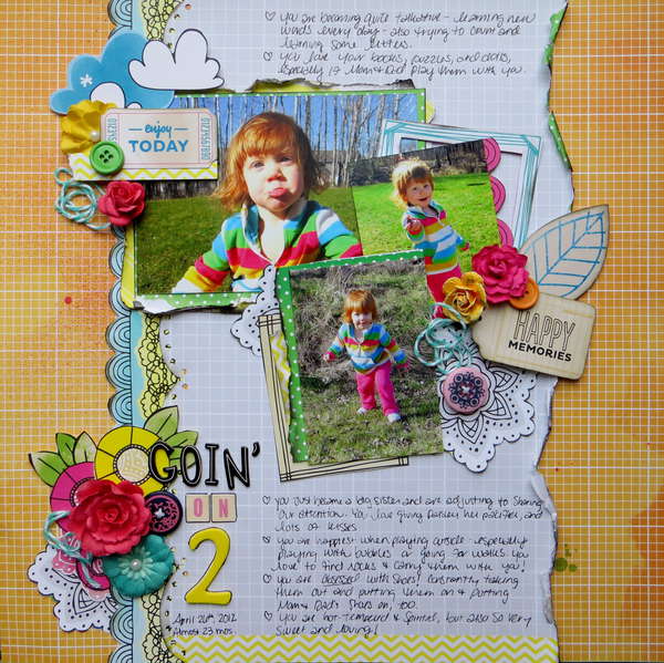
Goin' on 2 by Kelly Foster
Kelly reeled me in with the focal photo (what a great photo of that toddler lip!) but I love everything else about this layout, too! I love the graph paper with the torn and inked paper layered over it. Her embellishments balance the entire design and the colors she chose complement the colors in the photos perfectly. Great design!

And there you have it - our gallery highlights for the week! I only wish I had time and space to feature more of the amazing designs out there. Thanks so much to all of the designers who shared their work with us this week. What were your favorite gallery layouts this week? Feel free to link us to them in the comments and let us know what you think and which are your favorites this week!
-Stephanie Vetne
