CHA Summer 2011 | Authentique, Crate Paper, and Hambly
Our next set of booth photos from CHA Summer 2011 is a visual feast for paper lovers! Today we're featuring newcomers Authentique along with veteran CHA exhibitors Crate Paper and Hambly.
Authentique certainly made a splash last month when they introduced their first three paper lines, and they generated even more buzz by releasing three more beautiful lines just prior to CHA. Their Halloween line, "Glowing," features a very traditional orange and black palette accented with distressed home decor motifs and the usual Halloween icons.

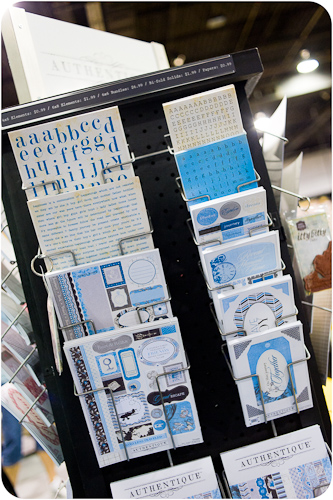
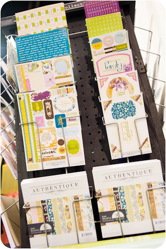
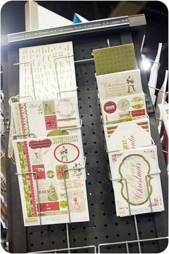
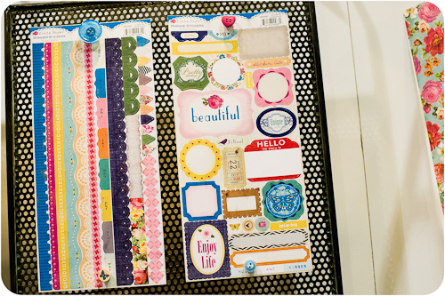
One of Authentique's strengths is the variety of embellishments they offer at such a reasonable price point. Those tiny letter stickers are definitely some of my favorites!
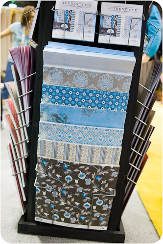
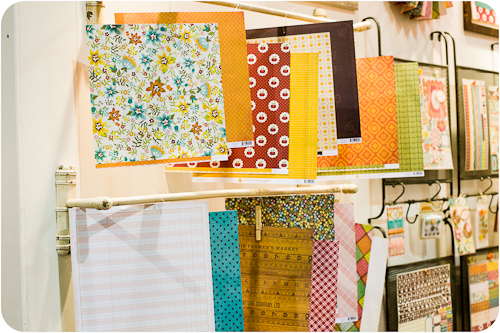
"Journey" was one of Authentique's first releases and combines pops of blue with cool grays and black. You can also find those colors represented in the sets of 12x24 solid papers that the company manufactures to coordinate with each line - an item that's definitely unique in the industry!
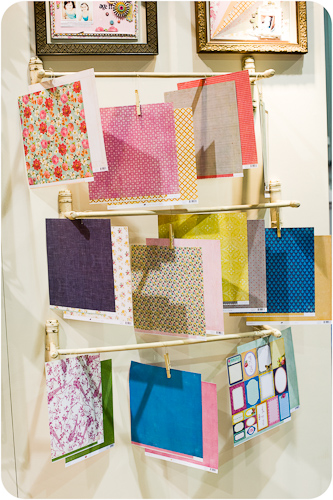
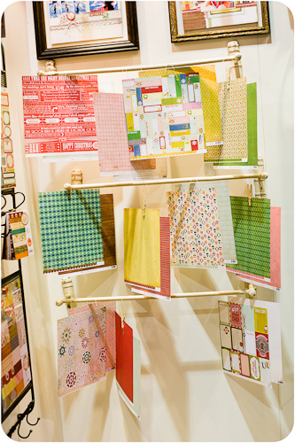
Notice those display racks? Authentique offers pre-loaded displays to retailers, giving them an easy way to quickly get product out onto the sales floor.
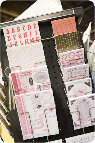
The sophisticated pink and grey palette of the "Uncommon" line lends itself well to the floral and quilt patterns that are featured in the collection.
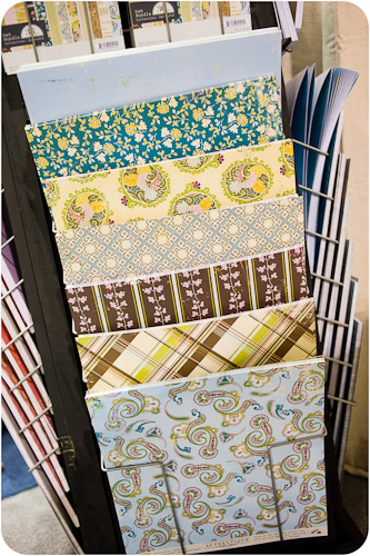
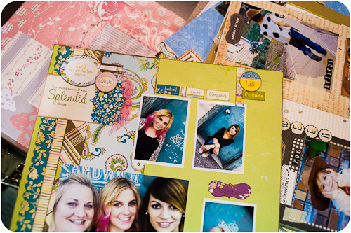
"Splendid" is loaded with a rich combination of turquoise, yellow, and brown in a variety of patterns. The mix of florals, plaids, and graphic motifs in this line make it versatile enough to use for both masculine and feminine layouts.
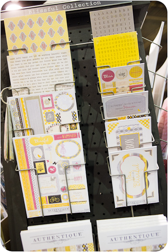
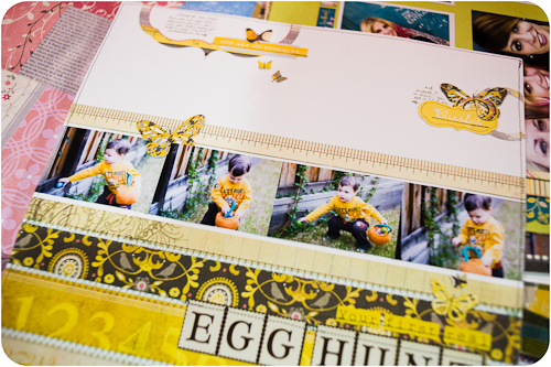
I made no secret of the fact that I fell in love with the "Blissful" line at first sight, and I even selected it as one of my pre-CHA picks! Yellow and gray is a hot color combination right now in the home decor industry as well as in scrapbooking.
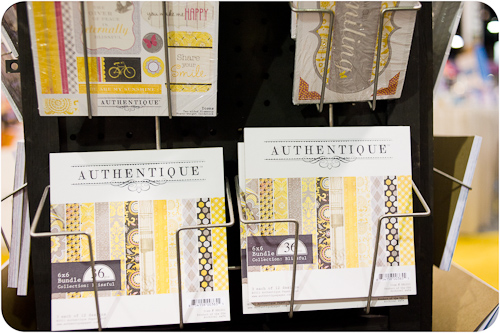
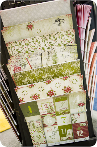
Authentique also offers all of their lines in trendy 6x6 pads!
"Wonder," Authentique's Christmas offering, sticks to a traditional color palette, but it leans more toward emphasizing green rather than red, making it really stand out against other similar lines at this CHA.
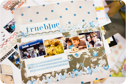
There were piles of layouts scattered on tables in the Authentique booth, so I settled myself in to photograph a few of them to share here.
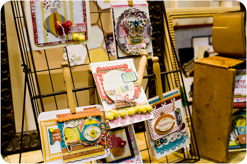
Crate Paper practically reinvented itself with its CHA Summer 2010 releases, and the Summer 2011 releases definitely followed in those footsteps!
"Farmhouse" carries hints of the style of "Restoration," released at the 2010 Summer show, but deepens the color palette and shifts more toward oranges and reds for fall.
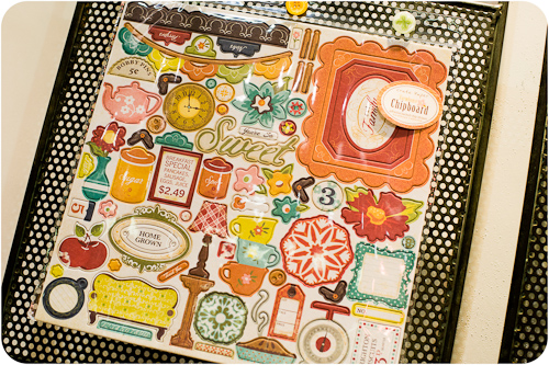
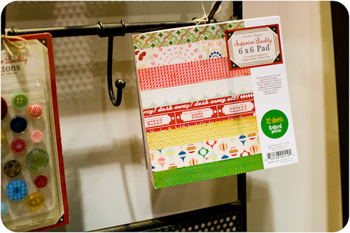
You'll find 6x6 paper pads for all of Crate's lines, as well, along with coordinating buttons and a variety of other embellishments (including a whole 12x12 sheet of chipboard shapes).
"Random's" mix of colors is almost the spitting image of the Pantone Fall Color Forecast that I reported on earlier this year. I think Crate managed to include almost every color in Pantone's report while at the same time blending them into a cohesive line. Well done!
"Peppermint" gets my vote as my favorite Christmas paper line of the entire show. I think the yellow is what won me over with its unexpected appearance in a holiday themed collection.
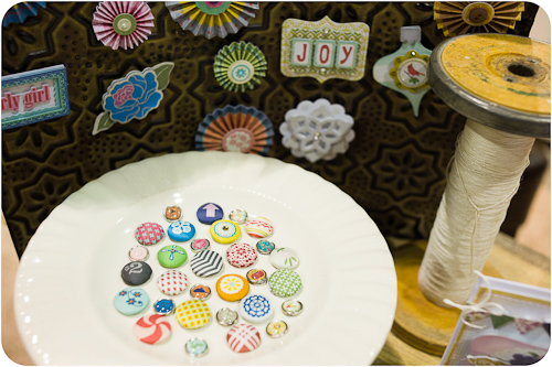
Isn't that peppermint patterned brad adorable?
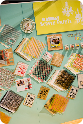
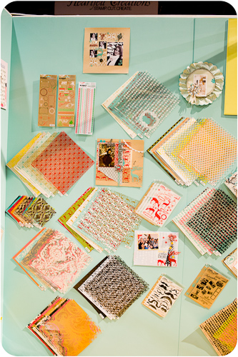
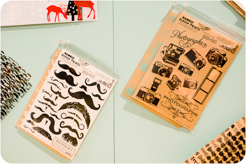
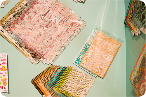
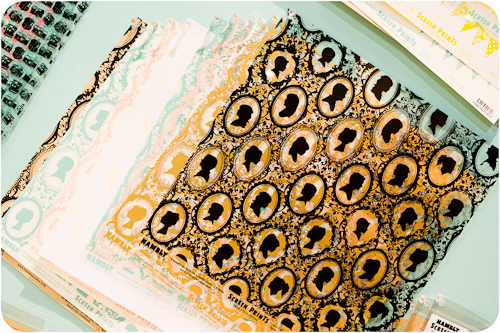
Hambly Screen Prints is well known for their hand-screened transparencies and papers as well as high-quality rub-ons. They debuted several new designs at CHA Summer 2011 as well as displaying several favorite patterns from their back catalog.
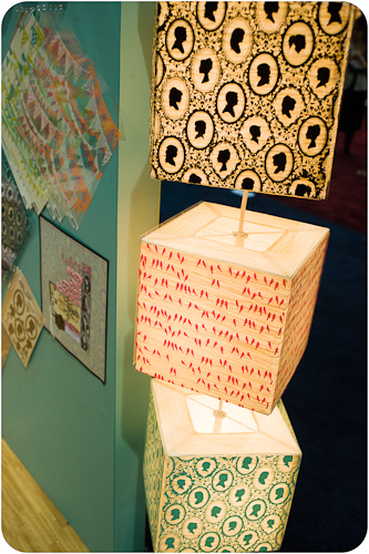
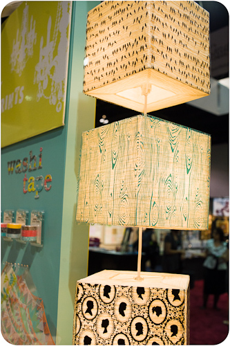
Hambly is also known for these creative lamp covers made with their transparencies- they change them up for every show!
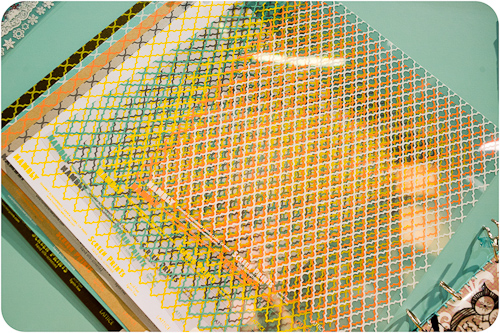
This quatrefoil pattern of the "Lattice" print is one of Hambly's newest offerings and also a popular pattern among several lines at the show. Hmmmm...do I sense a new trend in the making? I'll have to keep an eye on this one!
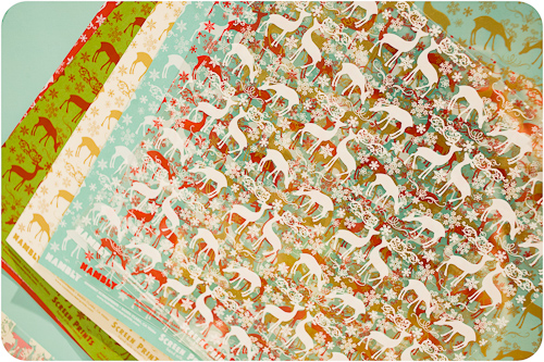
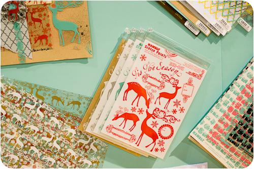
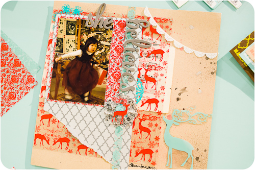
The colors and deer motif of the "Holiday Reindeer" papers would coordinate so well with Prima's new "North Country" line.
Hambly makes coordinating rub-ons for this print, as well.
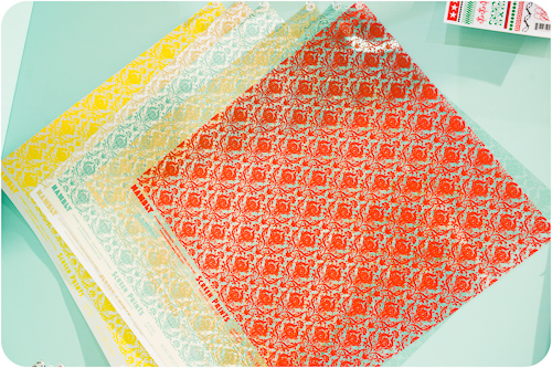
"Mini Brocade" is a scaled-down version of Hambly's original "Brocade" design.
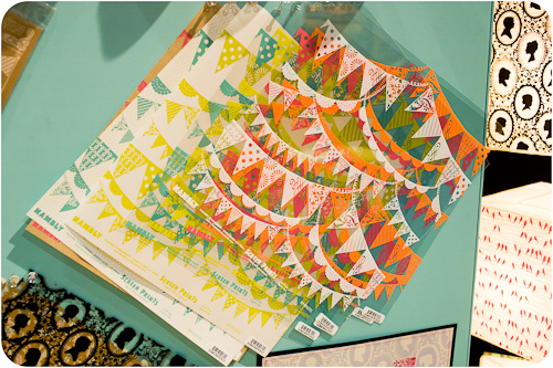
And they prove that pennants haven't gone out of style with their new "Banners" print and coordinating rub-ons.
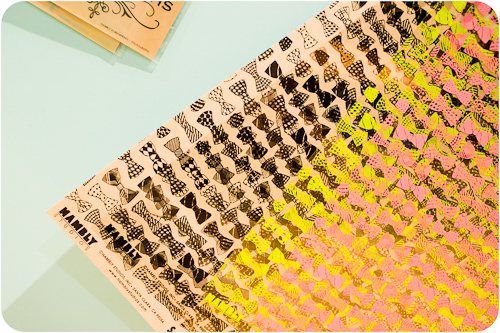
I'll round off the Hambly booth tour with a few quick glimpses of some of their most popular patterns from previous releases including bowties, cameras, woodgrain, and cameos.
CHA Summer 2011 isn't over on Scrapbook Update! We still have a few more booth tours to bring you, and also be on the lookout for a "behind the scenes with Scrapbook Update at CHA" post, coming very soon!
