Thank You Card with new Distress Color!
My new Rustic Wilderness Distress Ink has arrived! See all its possibilities in this somewhat masculine thank you card project that is great for the holidays - or all year long!
Disclosure: This site participates in the Amazon.com affiliate program. Links in this article are affiliate links to Amazon.com or Scrapbook.com that pay this site a commission at no cost to the reader when a purchase is made after a click.
Supplies:
Tim Holtz for Stamper’s Anonymous stamps
Ranger Tim Holtz Distress Ink:
brown ribbon
sewing machine
cream card blank
I was so excited when I saw that the new Distress color from Tim Holtz was a deep, true green! I’ve craved a “hunter” type green in my Distress palette for awhile. All of the other greens in the Distress palette are noticeably blue or yellow tints of green. The new shade Rustic Wilderness is noticeably neither (until you stamp the Oxide on a dark surface - more on that in a moment). It sits right in the middle between the yellow and blue greens, and its depth is so rich.
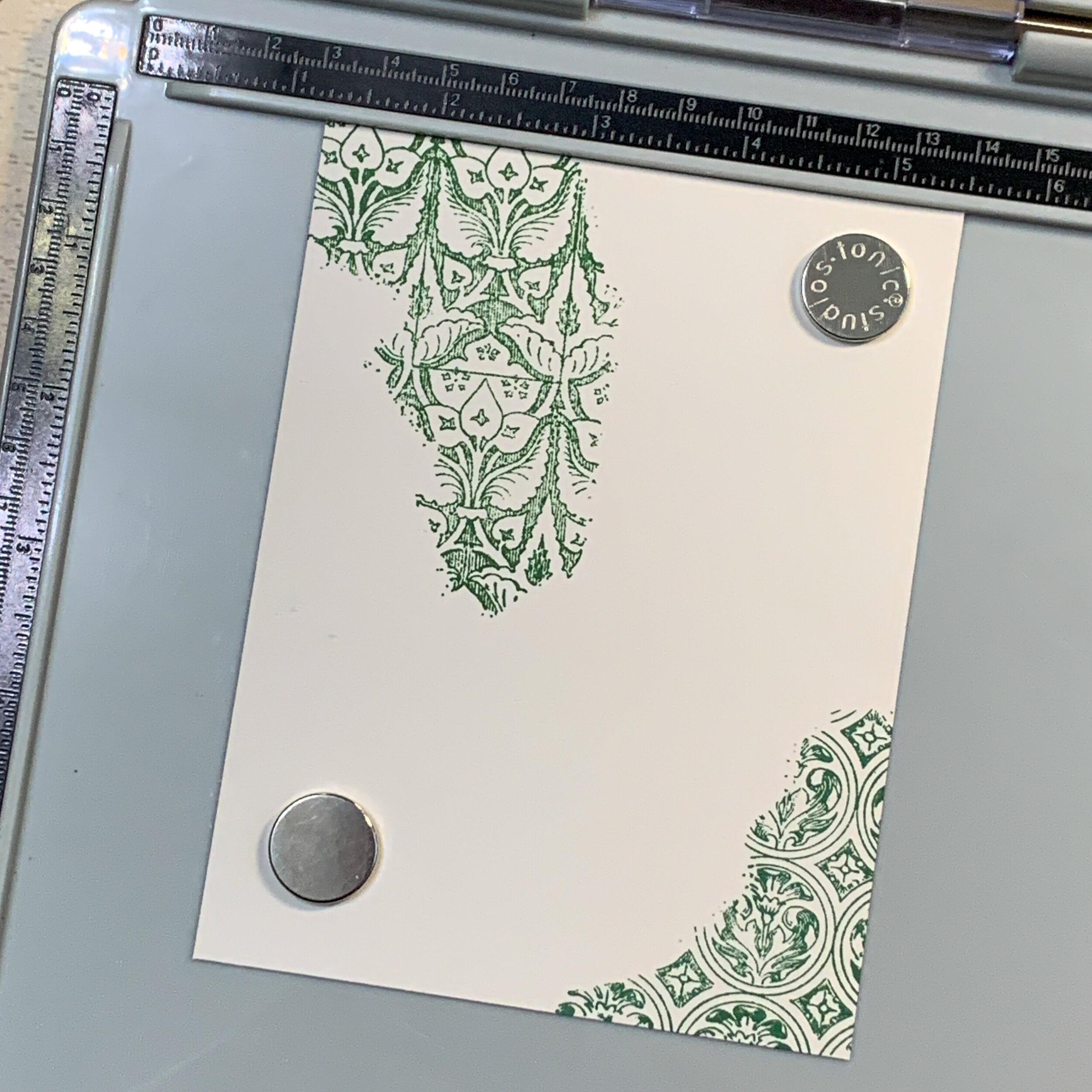
Despite its name of “Rustic Wilderness”, my first thought is that this new color would be excellent to use for creating elegant historic patterns. I tried out that theory on the background of this card with Tim’s “Fragments” stamp set.
The upper left above is the regular Distress Ink, and the lower right is Distress Oxide. Although a slight difference in texture is visible, the color of both versions of the ink appears essentially the same on this cream colored cardstock.
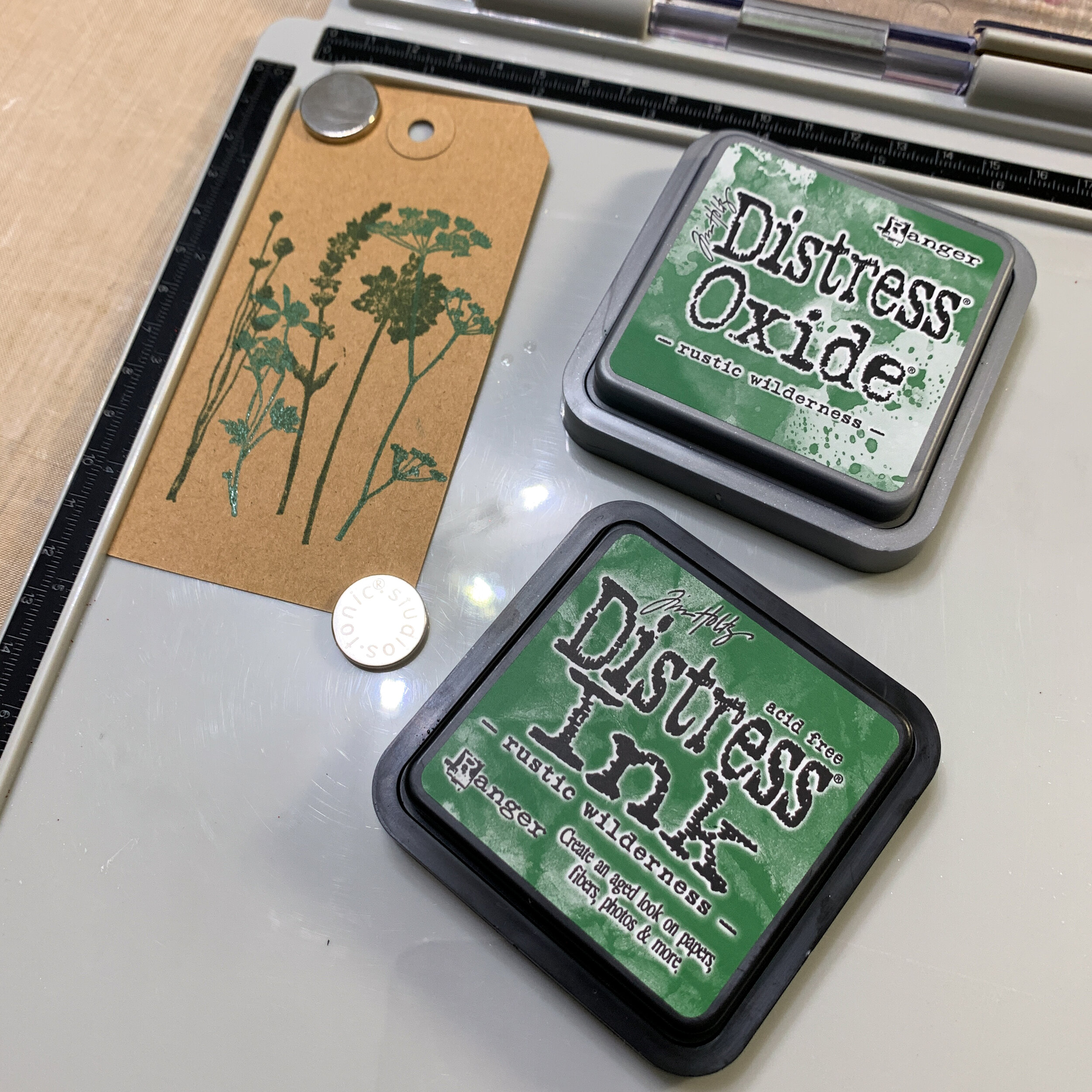
Things got a bit more interesting when I stamped the Distress and Oxide versions on a kraft background, however. The regular Distress takes on the brown background and appears much darker than it did stamped on the brighter cream. The Oxide, however, changed drastically! It became very blue (even though the original color didn’t appear to have a blue tint) and much brighter than the original Rustic Wilderness color.
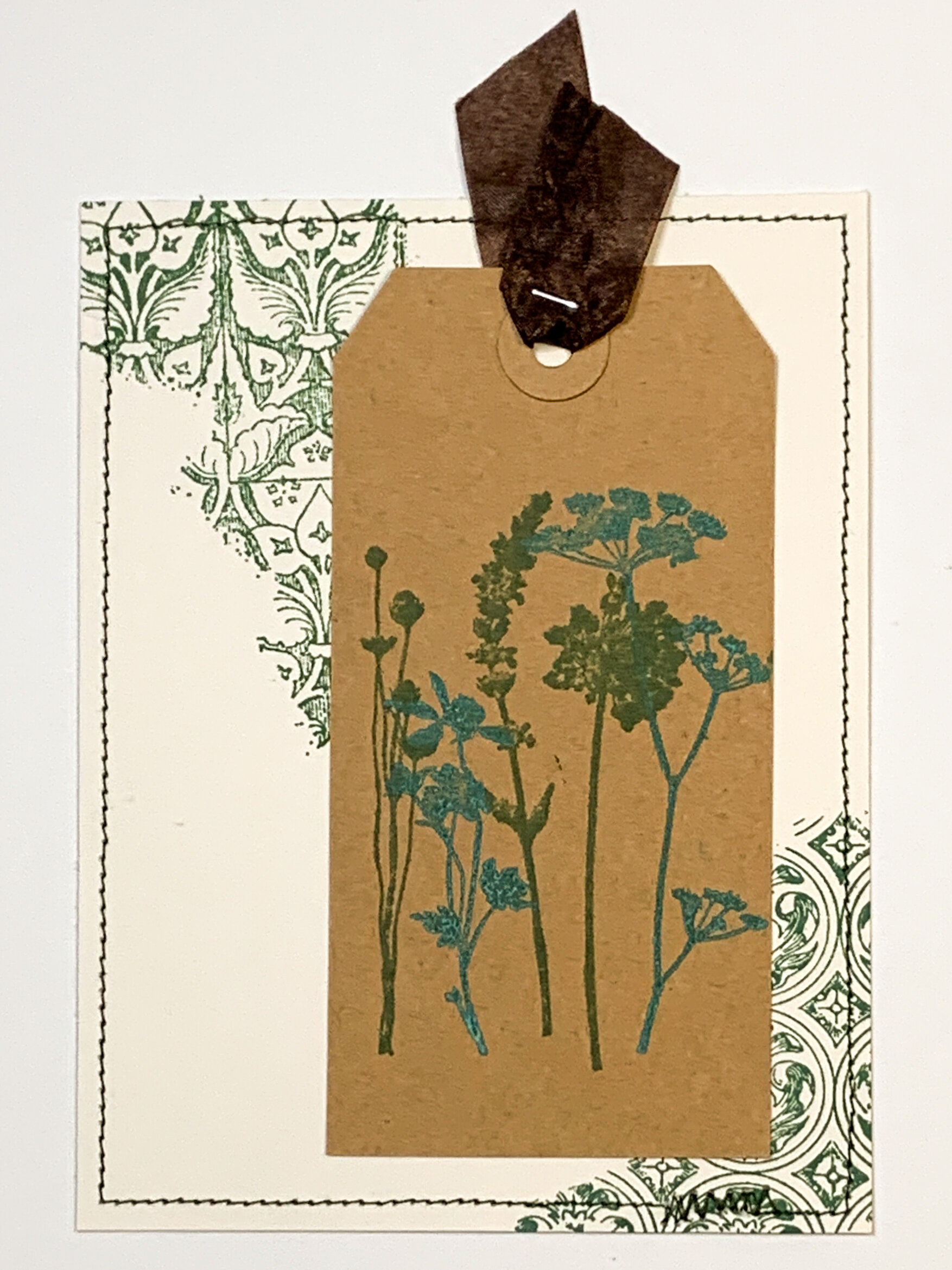
Combining the tag and the tapestry stamped background together created a card design that looked like it was created from a rainbow of inks. In fact it was all the same color, in two different ink formulations.
Of course, I couldn’t just leave that tag hole empty when I have so much beautiful ribbon sitting around! And I added some stitching around the edge for some more detail as well.
For the final touches, I stamped a sentiment label using the Simple Sayings stamp set. I cut it out by hand before gluing it down. Then I put a bit more stitching around the label for more texture, and topped it with some buttons, which are my go-to embellishment!
Rustic Wilderness is a versatile color that I’m sure will rapidly become one of the most-used colors in my Distress palette. I look forward to using it again and again!
What are you going to use it for?


