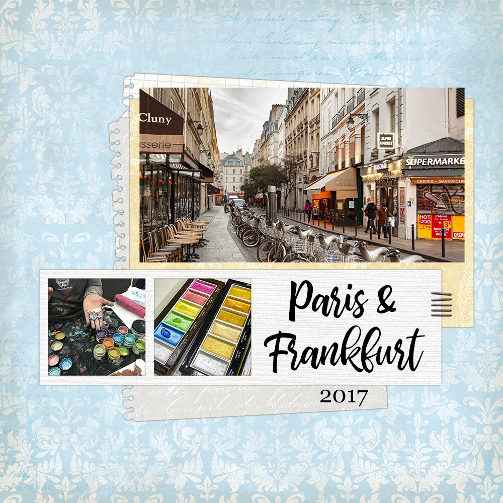
2017 Creativeworld & Paris Travel Album Digital Cover Page
Although I've been a paper scrapbooker for twenty years, I've occasionally dabbled in digital scrapbooking. Last year I went in January to Creativeworld in Frankfurt and to Paris. I decided for the first time to go all in on digital and create my Paris travel album as a digital photo book.
[Disclosure: Creativeworld's parent company, Messe Frankfurt, is a sponsor of my websites. Messe Frankfurt sponsored my trip to Creativeworld. Some digital products used in this project were supplied to me by Designer Digitals.]
Why take on this project in digital format? Well, I take a lot of pictures. I mean a lot of pictures. For this five day trip plus two travel days, I have over 1600 digital photos. And that is after I have done some deleting. Subtract the few photos that I took on the travel days and I averaged around 315 photos per day on this trip!
That's a lot of scrapbook pages, especially when done on paper. I decided my only hope of finishing this album was to scrapbook it digitally. The work goes faster that way and I usually get more photos on a page.I don't usually scrapbook in order, but today I am starting by sharing the cover page for it.
2017 Creativeworld Paris Travel Album Cover Page
Supplies Used for Creativeworld & Paris Travel Album Cover Page:
bhatoshine font
Georgia font
All digital supplies, except fonts, are by Designer Digitals.
How to Make A Digital Travel Album Cover Page:
Katie Pertiet Journey Layered Template
This page is deceptively easy to make because it utilizes a layered template for Photoshop. I love using these as a great shortcut for starting my pages. Often the finished page looks very little like the template I started with, but it gives me a jump start!
For this page, I hid the journaling text and title. I replaced them with a large title that takes up that whole space. I also hid the "recorded" stamp. It wasn't needed for the date since I added the year below the title.
When I work with templates the first thing I add to my layout are my photos. I start by editing them in Adobe Lightroom and then open them as smart objects in Photoshop. This way, if I decide later they need more editing, I can do it easily.
Having the photos in place lets me start trying out papers for the layout with an idea how they will really look. I'll admit, I tried dozens of papers on this layout before finding a set that I liked. They needed to complement each other and the photo. I initially intended to use darker colors. But I found that the dark elements in the photos looked muddy against them. So I switched to lighter colors that the photos would contrast and "pop" off of!
It's fast using templates but that doesn't mean I skip the details. For instance, the notebook paper elements on the page are angled. So after I dragged my paper into those elements, it didn't look right. I had to take a moment and rotate it to match the angle of the element. This was especially important because I chose text and graph paper designs with distinct directions.
More Frankfurt & Paris Digital Travel Album - Coming Soon!
Frankfurt & Paris Travel Album Cover Page - Digital Scrapbooking for your travel photo album!
I can't wait to share more of this Frankfurt and Paris digital travel album that I've been working on with you all! Working on it is making me very excited to go back, which I will be doing next month to attend the Creativeworld trade fair in Frankfurt.


