Project | Travel Pocket Album Pages with Simple Vintage Traveler by Katie Pertiet
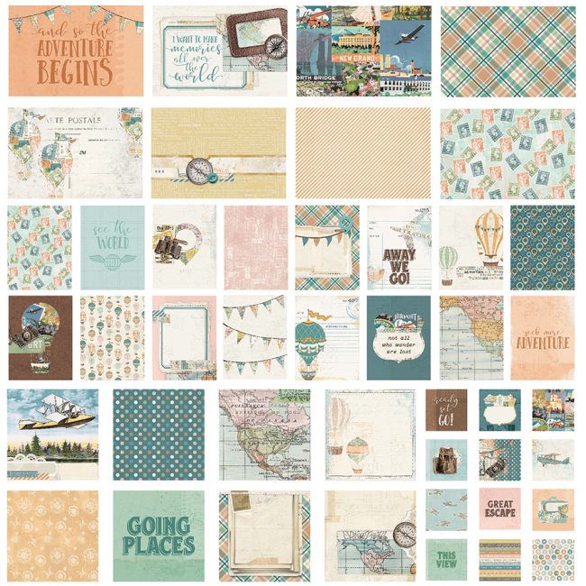
Travel is always one of the big themes of the winter show, and it's also one of my favorite scrapbooking themes! Today I'm trying out another one of the new travel collections to make it into my personal stash - Simple Stories Simple Vintage Traveler by Katie Pertiet.
[Disclosure: Some products in this article were provided to me by Simple Stories as editorial samples. This site participates in the Amazon affiliate program. Some links in this article are affiliate links that pay this site a commission at no cost to the user when a purchase is made after a click.]
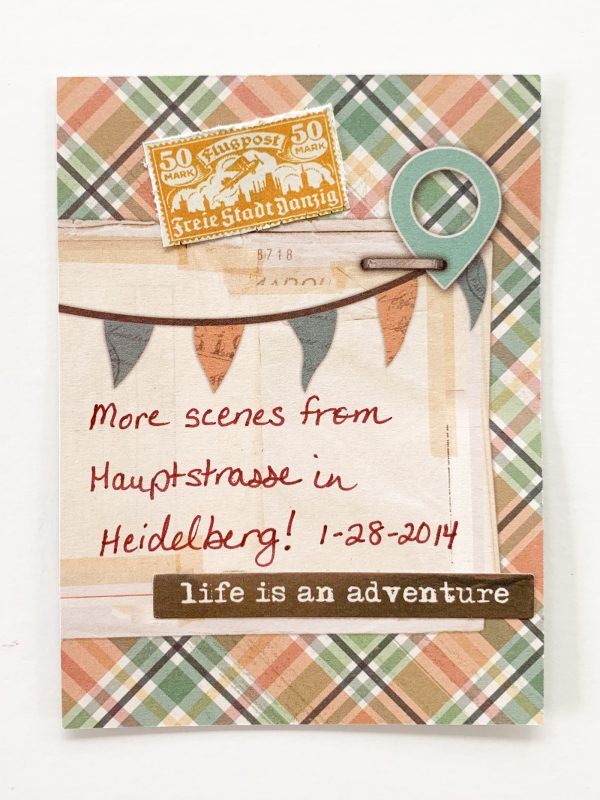
Many of my loyal readers may remember that I've been gradually plugging away at a pocket scrapbooking album of my 2014 trip to Germany for the Creativeworld trade show in Frankfurt, and the day I spent touring in Heidelberg during that trip. As soon as I saw the new Simple Vintage Traveler SNAP Cards that Katie Pertiet designed for Simples Stories, I knew they would make some great pages to help finish my album!
(Click here to view the other pages from my album.)
Katie has long been one of my favorite designers in the industry, since the days when I was hoarding the products she was designing for Autumn Leaves, so I couldn't wait to use it when I heard she had a new travel collection coming!
Simple Vintage Traveler Snap Cards
The Simple Vintage Traveler SNAP Cards pack contains 48 double-sided cards in various standard pocket album sizes. For those wanting even more pocket card designs, the paper collection also contains three cut-apart sheets featuring 4x6, 4x4, or 3x4 card designs on one side.
Travel Album Discover Side Streets
Supplies Needed:
Simple Stories Simple Vintage Traveler Combo Cardstock Stickers
Cricut Design Space file - Discover #M4291A
date stamp
pencil
white eraser
craft knife & glass mat
I started this two page layout with a pile of what seemed like random photos from my time in Heidelberg's alt stadt (old city). Two of them were vertical, so I was just going to use the page on the right to hold those and arrange the rest wherever. But then I discovered as I shuffled my photos around that it seemed like three of them did have a theme. They were all views of the city's narrow side streets. I decided to separate those out onto a page together, and do two single pages instead of a double page spread. But only one of those photos was vertical, messing up my plan for using those two vertical pockets on the page protector on the right side!
discover Heidelberg
The solution was to try a technique I hadn't attempted before but often admired in other people's pages: spreading a large photo out over several pockets! I reprinted one of my photos in a 6" x 8" size. Its composition worked perfectly to allow it to be cut to fit across 3 pockets without slicing anything critical.
I arranged several of the other photos around it, and was left with just enough room for a title and journaling card.
discover title card
My title card is a 4x6 card from the Simple Vintage Traveler SNAP Cards set. I added some strips of the Simple Vintage Traveler Washi Tape to it to make a background for my title. Then I cut my title out of a sheet of paper from the 6x8 paper pad. I used a pre-designed title on my Cricut Maker. All I had to do was resize it to the size I needed, load my machine and hit go!
To adhere my title, I sprayed the back of it with new Mod Podge Ultra. The amount of handling needed to adhere a die cut with other adhesives has frequently damaged them when I've been working on projects. The Mod Podge Ultra spray is a no contact method of applying adhesive, so it reduces the chance I'll damage the item! Then I can just gently pick it up and lay it in place. And it will adhere without a lot of pressing in place - another way to avoid tears and creases in delicate parts of the die cut.
Simple Vintage Traveler journaling card
For my journaling card, I added a few pieces from the Bits & Pieces die cuts collection to it. Before adhering the stamp, I trimmed a bit of the white off. Then I used the paper distresser on it to give the edges some dimension similar to a perforation.
Even the pen I used for my journaling carries a piece of the story of my trip with it...it is part of a set of Pigma pens that I bought at the airport in Frankfurt on the day I flew home!
Side Streets Heidelberg
The other page in this two page layout went together quite quickly once I had figured out that the photos had a theme. Normally I like to use a 4x6 card for a title but this pocket page has a 3x4 card in the top left. So I made a mini title card!
Side Streets Title Card
I started by fitting the title on the card. (Only I could come up with a title that uses up all the E, S and T stickers on a sheet!) Because the title filled in all the white space on the bottom left, I wanted to fill in the top right to balance it. So I stamped the compass stamp. For similar reasons, I put the Explore die cut on. (That item I raised on foam adhesive for some dimension.)
The final touch was the journaling card for this page. I had a big empty vertical 4x6 slot to fill in my pocket page. But the SNAP pack's cards were all designed horizontal. So I needed to make a card.
Side Streets journaling card
I started with a 4x6 card base cut from a sheet of paper from the 6x8 paper pad. Then, I layered a 4x4 card from the SNAP pack over it. I wanted to make the card appear a little more "finished", to fit in better with the other items. Covering the seam at the top with washi tape helped. Then I added a piece from the Bits & Pieces pack to the bottom after using a craft knife to cut off the white edge from it.
I'm really excited to be making progress on this album again, and I can't wait to make more layouts with this collection! Watch for more pocket page and 12x12 pages coming soon with it!


