A Spring Travel Layout with Authentique's Dreamy Collection!
We don't get much resembling spring here in Florida, so it seems a waste to buy a collection that is spring themed. But that doesn't mean that I don't get the itch to use create some projects with spring colors.
[Disclaimer: Authentique Paper, Buttons Galore, and Cricut provided some products used in this article but this is not a sponsored post. This site is a participant in the Amazon affiliate program. Some links in this article are affiliate links that pay this site a commission at no cost to you if you make a purchase after a click.]
Authentique Dreamy collection
Authentique's new "Dreamy" collection was the perfect solution to that dilemma this year! It's filled with spring shades, and pretty butterflies and flowers. But the flowers aren't spring bulbs and the rest of the designs are various geometrics and graphics. This means the Dreamy collection is usable for a wide range of topics, such as gardens, babies, and cute kids.
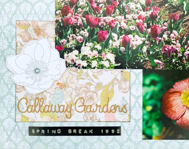
I did decide to pair Dreamy with spring blooms for this first layout. These spring bloom photos are from a college spring break trip to Callaway Gardens in Pine Mountain, Georgia.
Authentique Dreamy spring layout
Supplies Used:
Authentique Paper "Dreamy" collection (Scrapbook.com, Simon Says Stamp, Amazon)
Tim Holtz idea-ology Quote Chips (Scrapbook.com, Simon Says Stamp, Amazon)
Stamper's Anonymous by Tim Holtz "Flower Garden" stamps (Scrapbook.com, Simon Says Stamp, Amazon)
Tim Holtz stamp platform (Scrapbook.com, Simon Says Stamp, Amazon)
Ranger Archival Ink in Shadow Grey (Scrapbook.com, Simon Says Stamp, Amazon)
28 Lilac Lane by Buttons Galore "Cotton Candy" bottle (Scrapbook.com)
Dymo Organizer Xpress labeler (Amazon)
smooth white cardstock
Ranger Tim Holtz Distress Oxide ink in Hickory Smoke (Scrapbook.com, Simon Says Stamp, Amazon)
These photos obviously have a lot of color in them. That meant I had to be careful what other colored elements I used with them or it would both drown them out visually and end up looking like a circus.
I decided to use a very neutral blue print for my background and then use more bold prints to create pops of color in certain areas.
Authentique Dreamy spring layout
I used full sheets to plan the general concept of what colors I wanted where. Then I measured the areas that I wanted to fill and cut pieces. The idea was to fill some of the white space without making it feel crowded, and to balance photos in other areas of the page.
Authentique Dreamy spring layout
I actually ended up cutting that flower piece twice. After I cut it I decided that I wanted to create the title on it with a pen in my Cricut Maker. So I set up the cut shape in my Cricut Design Space and added the text.
Before I glued down all the paper blocks, I inked the edges of all of them to help the layered patterns stand out from each other.
Authentique Dreamy spring layout
I no longer have a record of the exact dates of the trip, so I just put the year and "spring break" on the date label. I decided to use the black label because it was the perfect size and added some black to balance the dark photos to the huge expanse of light color in that bottom corner.
Authentique Dreamy spring layout
I had some awkward blank spaces I wanted to fill - above the title, a square area in the center of the layout - but I didn't want to be heavy handed about it and compete with the photos. I settled on creating these white and gray stamped flowers as a subtle fill for the areas. I highlighted the title block by using foam tape to apply the flower there.
Authentique Dreamy spring layout
Authentique Dreamy spring layout
Even though I'm a simple scrapbooker, the patterned paper blocks by the top two photos looked a bit bare to me. I selected chipboard embellishments to add to them. The chipboard adds some dimension, and the sentiments add a touch of journaling as well.
Want to see more Authentique Paper layout fun? Click to see a travel layout I made with their beautiful new travel collection, Quest!


