Scrapbook Layout | Beautiful Life - Notre Dame de Paris
As I mentioned in my last article, I have Paris on the brain lately...and part of the reason is that I've been busy creating scrapbook layouts from one of my Paris trips the past couple of years! This Paris scrapbook layout of Notre Dame showcases one of my favorite photos from my 2017 trip.
Paris scrapbook layout Notre Dame Cathedral using Tim Holtz products
It's been awhile since I created a layout that had this many elements on it (and no stamps)! I really went to town digging in my Tim Holtz stash for this one, since so much of his stuff is perfect for a historic city like Paris.
[Disclosure: This site is a participant in the Amazon.com affiliate program. Some links in this article are affiliate links that pay this site a commission when a purchase is made after a click. The label maker was provided to me by Dymo to use in a previous sponsored post, but has since become a go to tool for me because I just really like using it.]
Supplies Used:
Tim Holtz idea-ology "Memoranda" paper pad (Scrapbook.com, Amazon)
Tim Holtz idea-ology "French" Design Tape (Scrapbook.com, Amazon)
Tim Holtz idea-ology "Reinforcers" stickers
Tim Holtz idea-ology "Compass Coins" (Scrapbook.com, Amazon)
Tim Holtz idea-ology "Game Spinners" (Scrapbook.com, Amazon)
Tim Holtz idea-ology "Adornaments - Arrows" (Scrapbook.com, Amazon)
Tim Holtz idea-ology "Adornaments - Nature" (Scrapbook.com, Amazon)
Sizzix Tim Holtz Alterations "Adventure Words - Script" dies (Scrapbook.com, Amazon)
Sizzix Tim Holtz Alterations "Tiny Tags & Tags" die (Scrapbook.com, Amazon)
Sizzix Tim Holtz Alterations "Mixed Media" dies (Scrapbook.com, Amazon)
Sizzix Big Shot machine (Scrapbook.com, Amazon)
Ranger Glossy Accents (Scrapbook.com, Amazon)
cardstock (blush pink)
date stamp
hole punch
There were so many beautiful paper sheets in the Tim Holtz Memoranda pad that would have worked with this 5" x 7" photo! It was a hard decision but I ultimately chose this paper design because its yellow tones work with the yellow sunrise that I wanted to highlight in the photo. And the yellow is the perfect contrast to all the gray tones in the photo, making the photo pop off the background.
But this pale paper had a problem with the photo. The pale sky just kind of melted into the pale paper. A few strips of dark Tim Holtz "French" Design Tape under the top of the photo fixed that. And it had the added bonus of providing a way of "grounding" the photo on the background.
Paris Notre Dame layout construction
Next I started building my main embellishment area. I used some of the 6x6 paper designs from the Memoranda pad to create two tags. The small one is die cut and the large one is hand cut because I wanted an extremely specific size. I chose the reddish pink paper for the large tag to highlight the pink in the sky. The blue-gray tag highlights the cathedral itself.
A piece of design tape and a hole reinforcer on the large tag help tie the two tags together by moving the blue-gray color across to the pink tag.
Paris Notre Dame layout construction
The title is cut from yet another color, a shade of coral or blush pink that is also in the sky.
I didn't want to layer yet another paper design element over the tags. So I typed my journaling on the computer and then printed it on inkjet vellum that could go invisibly over the large tag. A few Tim Holtz Adornaments finished the tag area by filling in some awkward white space.
Paris Notre Dame layout construction
Underneath the tags, I got out my trusty labelmaker to make a kind of sub-heading for the page with the cathedral's name. Right above that I used a date stamp to put the date on it. (Tip: Check the year on the stamp when you use it! It says the year of the last layout I did. Ooops!)
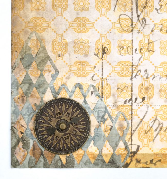
The layout was a bit right side heavy, so I wanted to fill in some space in the bottom left corner. I used some of the Memoranda paper and a Tim Holtz Mixed Media die to create a texture layer in that corner. Then I put a Compass Coin on top of it! This added to the travel theme, created some more visual weight in the area, and also balanced the metal color of the elements on the tags.
Paris Notre Dame layout construction
This is a lot of elements but it was easier to assemble than it sounds. Because almost all of the elements in this layout are designed by Tim Holtz, they coordinate easily!
I have several more layouts in various stages of completion from this same trip...I can't wait to share them with you all!
Notre Dame scrapbook layout


