Highlights from SPC Mixed Media Show 2015
This year, instead of my usual trip to the Craft & Hobby Association's summer show (called the CHA PaperArts show in recent years), I decided to try something new for a summer trade show experience by traveling to Salt Lake City for the SPC Mixed Media Show in late July.
The SPC Mixed Media Show is put on by the Sierra Pacific Crafts buying group of stores, and until last year was not open to non-members. With the demise of the traditional CHA Summer show after the 2013 show in Las Vegas, SPC made the decision to open the show for part of its time to non-member buyers, and to host the show to Salt Lake City. The result has been a rapid growth in popularity of what was until recently a relatively unknown event.
There is one catch for those willing to take part, however. While the doors have been opened to make non-member buyers welcome, manufacturers can still only exhibit by invitation. That hasn't stopped the show from being popular with both buyers and manufacturers, however (especially since so many manufacturers are based in the Salt Lake City area).
I spent two days at the show this year....here's some highlights of products and trends that I saw during my visit!
Just like at the CHA Mega Show 2015 in January, one of the undisputed stars of the SPC Mixed Media show was Ken Oliver. Ken was debuting a new line of papers as well as promoting and demonstrating his incredibly popular Colorburst pigment powders.
Colorburst capitalizes on the current trend of watercolor looks. Several other companies at the show also had products showing off watercolor looks:
The Seven Paper-branded "Clara" collection from Studio Calico includes this gorgeous watercolor mosaic sheet, as well as a text sheet that looks like it was written with a watercolor brush.
Amy Tangerine's new collection for American Crafts blends a watercolor look with another big trend: photorealistic images. The photorealistic look was very big in the early days of the scrapbook trend (think 1999 or so) but disappeared a long time ago. It's now reappearing in a variety of stylized forms, inspired by internet meme graphics and other Photoshopped looks that are invading our everyday life.
No one has jumped into the photorealistic look as big as Ken Oliver Crafts. His paper line features 12x12 papers with full color images of buildings on them, a revival of the full-sheet photorealistic look that the industry hasn't seen in about 15 years - but done in a new photo filtered style instead of the true life style last time this trend was around.
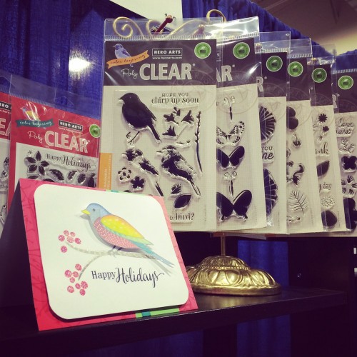
Layered stamps, like these from Hero Arts, seem to be on the rise. The look of layered stamping can easily be made to mimic watercolor, and the growth of popularity of this type of stamp corresponds most likely to that trend.
Another stamping trend is the explosion in availability of stamps for use in planners. Planners continue to be popular in the market, with several new releases at the summer shows, and many companies are pursuing that trend with stamp releases. New manufacturer Waffleflower makes a series of very popular stamps that include calendar designs as well activity and to do items.
Perhaps the most unique, however, of the Waffleflower planner stamps are the sets that let you record the weather in your planner!
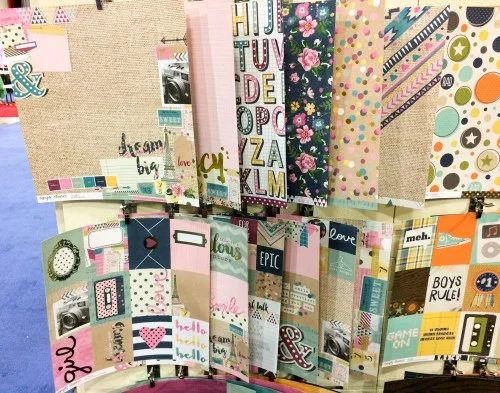
In addition to their new planner line, Simple Stories also released lines called "So Fancy" and "So Rad". These lines, a great balance between not kid but not adult either, are just a couple of the growing number of teen memory suitable lines being released by companies in the last year or so, a topic that until recently was a largely ignored area in the industry despite a vocal demand for it in some quarters.
So why is the industry paying more attention to teenagers finally? The answer lies in demographics. A huge cohort of the industry's customers were young moms who joined the hobby in the 2000-2005 boom, motivated to scrap their small children. A decade later, those small children aren't so small anymore - they are teenagers, creating a demand for companies' product line to age with their consumers' families.
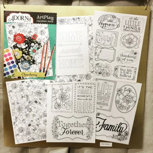
While the kids' lines are getting older, the adult lines are getting...younger? The trend for adult coloring books was on display at the SPC show, most notably in the Adornit booth with their new line of Art Play books. This trend is not only therapeutic for its enthusiasts but also great for the crafts industry. It encourages adults to play with various mediums just for the sake of playing, without the pressure of creating a project they will feel the need to display or gift. This avoids the loss of customers due to a self-perception of lack of skill, while at the same time the activity encourages the purchase of art mediums and supplies that are higher ticket items. A lack of high ticket items being purchased is a financial issue that has plagued the scrapbook industry for the past 10 years, as existing customers subsist largely on the purchase of low ticket items like sheets of paper. This has made sales conditions challenging for store owners.
It wasn't just coloring books - new product types were all over the show floor, as a lot of scrapbook companies look to expand their offerings beyond scrapbooking in one way or another. Jillibean Soup is continuing to expand their amazing "Mix The Media" line that currently has a few SKU's on shelves at Walmart.
Considering the time of year, there was a lot of flowers and other more spring/summer type designs on display. This "Wildflower" collection from We R Memory Keepers includes flowers and butterflies, along with vibrant shades of pink, yellow, blue, and green normally reserved for other times of the year - and it was far from the only such example on the show floor.
The floral trend even infiltrated the fall lines where you'd expect to see an abundance of fall leaves and pumpkins. Pink Paislee's "Cedar Lane" collection was an excellent example of this, with florals in fall tinged colors alongside acorns, feathers, and other more traditional fall elements. Echo Park's fall line by Lori Whitlock as was infused with floral elements.
Even Christmas was not immune from the floral invasion. Graphic 45's absolutely beautiful "A Christmas Carol" line features what appears to be vintage roses - an unorthodox choice for the winter holiday but a welcome one for residents of warm holiday climates like myself.
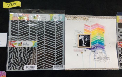
Some trends are sticking around but changing - like chevrons. Originally, the chevron trend was very hard edged, but now it's morphing into softer, rounder edges like on this Ronda Palazzari stencil from The Crafter's Workshop. We're also seeing chevrons being incorporated into patterns rather than as a standalone element.
Pets continue to be a hot theme for manufacturers, as they were in early 2015 product releases. Bella Blvd has joined the pet trend with their twin mini collections "Riley" and "Rover".
Pets were also on display at The Crafter's Workshop, with dog and cat stencils from designer Carmen Medlin.
Another trend that continues to be big is "small" - meaning, scrapbook items are getting smaller and smaller. Bella Blvd's new "Tiny Text" alphabets are a perfect example of this trend, which is being fed by the continued popularity of another trend: pocket scrapbooking.
Speaking of small things influenced by pocket scrapbooking, sequins continue to grow in popularity. These new self-adhesive sequins in a range of basic colors from Jillibean Soup are sure to popular with both pocket scrapbookers and cardmakers.
There was so much to see at the SPC Mixed Media show...the second half of 2015 is going to be full of exciting products!
