CHA Mega Show 2015 | Nancy's Picks
The Hot Picks bring you the buzz from CHA shows, but sometimes my personal taste varies from what is "hot" or there isn't room to include all of the things that I think are exciting.
So in honor of Valentine's Day, let's do "Nancy's Picks", my personal list of what I fell in love with at the CHA Mega Show 2015.
First up is one of my favorite Instagrams from the show! I've always loved the concept of Faber-Castell's Gelatos, but the color palette of brights and primaries left me really cold. Now though, they've released a palette of pastel colors for the line that I believe will increase the product lines usability for me (and a lot of other people). Plus it makes for very pretty rainbow pictures!
Speaking of pastels, the normally very bright Simple Stories is also deviating from their usual color themes. This new line of basic patterns and alphabet stickers in a range of light colors will be great for cardmaking and for girly scrapbook pages! This girl mom is so happy to have a softer look from Simple Stories to work with.
I've never been a big user of transparencies, but these new acrylic sheets from Bella Blvd really have me inspired. I cannot wait to die cut them! I also want to turn them into custom dividers for small albums.
What could be better than kraft and metallic together? I couldn't believe that I didn't hear more buzz at the show about the new Tim Holtz Kraft-Core Metallic Collection. Embossing this paper is going to be amazing.
I love products that make it easy to create intricate, difficult looking effects. This new line of dies (the heart set is shown below) from Taylored Expressions creates beautiful dimensional effects. I don't care what Alton Brown says about uni-taskers. These are fabulous!
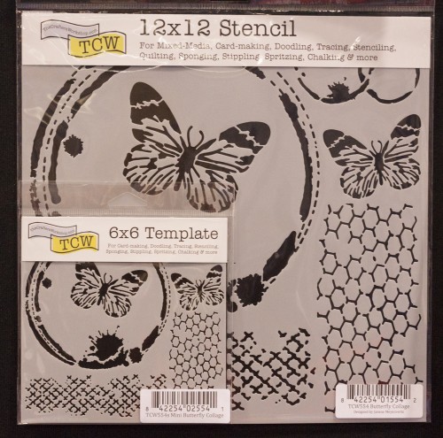
Stencils are one of those things that I've had a love/hate relationship with for a long time. I like them in theory but when faced with the reality I usually lock up about what to do with them - at least until I saw the new stencil collection from The Crafter's Workshop at the CHA Mega Show 2015. My head immediately filled with ideas of how to use these and many other of their new stencils!
Above: Mini Butterfly Collage and Butterfly Collage
Above: Life Tidbits and Mini Life Tidbits
I went into great detail about Kelly Purkey's new stamp line with Hero Arts (which I think will be a great success) in one of my previous CHA Mega Show 2015 articles. Personally, my favorite piece from the line by far is the outline alphabet! It's the perfect size for cardmaking, pocket scrapbooking, and even for small headings on 12x12 layouts, making it a versatile addition to a stamper's toolbox.
Also from Hero Arts comes another one of those products that I love because it makes a difficult looking effect - ombré - actually easy to create. The new Hero Arts Ombré ink pads are a secret weapon that will make quick and easy projects look not so quick and easy!
Another new ink that I will be snapping up in 2015 is the new monthly Tim Holtz Distress palette colors from Ranger. This is, frankly, genius on their part, allowing them to develop their palette in response to trends over the course of the year without committing to new colors long in advance. The first two colors, a light green and a coral, seem to show a commitment to brightening the Distress palette somewhat, something that makes me very happy. I love my Distress but want a broader range of options!
A lot of the scrapbooking that I have been doing lately has been travel pocket pages. These pages involve way more memorabilia than my typical pages and housing those items often involves "hacking" custom pockets or pages with my sewing machine or other methods. Project Life's new Photo Sleeve Fuse will let me create custom pockets for my items that blend right in with my album's other pocket pages - like it was designed that way!
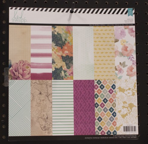
In the last couple years I have become a huge fan of Heidi Swapp's paper pads. Many I have purchased in multiples, using the same papers over and over. Heidi's two new paper pads on display at CHA made me lightheaded with delight! I'm definitely scheduling some time to play with these quirky mixes of florals and modern graphic prints.
Good solid basic tools are a passion of mine and Lawn Fawn has made me very happy by expanding their selection of stitched shape dies. These are the sort of tool that you can use over and over!
Since a lot of my recent scrapbooking has been travel oriented, a lot of my giddy moments of excitement at the show were focused on travel products. Pink Paislee's new Atlas collection is a nice modern and graphic look at travel, a theme that has traditionally been dominated by more cute and cartoony lines, or heavy vintage. This look is great for urban tourists especially.
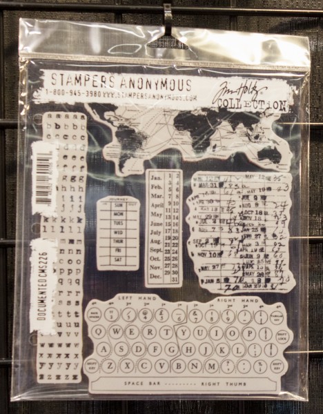
Stamps have been a big part of my travel pocket scrapbooking and for my Europe pages, a lot of it has a vintage style. This has had me digging deep into my Tim Holtz stamp collection, so I was thrilled to see this new set with the map at CHA! I'm a bit obsessed with map icons!
Another thing I'm using a lot of are the mini stickers that look like they came off of a typewriter. Tim Holtz's are my go-to when I need a little embellishment. So I am really excited to see not one but two new products in the line, including a new larger sized option!
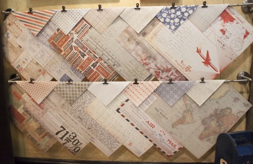
Tim's new Air Mail paper pad made me so happy! I've always loved air mail themes and the maps and the B side designs will coordinate beautifully with the other vintage elements I've been using in my Frankfurt travel album.
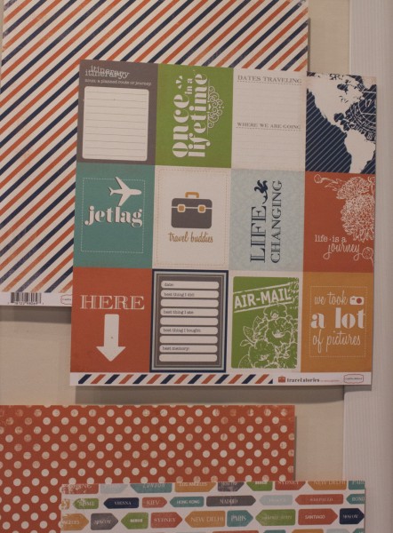
My travel album, however, is a bit schizophrenic. Europe is a mix of ultra-modern and the very old (often crammed right next to each other). My album is, too. For that reason I also like the Travel Stories collection by Carta Bella. The color scheme is rich, the design is simple, and yet it also incorporates some elements (like the memorabilia) that ties it to the vintage elements that I'm planning on using it alongside.
