Gallery Highlights | 3.28.2013
Welcome to another edition of gallery highlights! This week turned into card week - I was blown away by how many gorgeous cards I saw this week, and I really wish I could have featured a lot more. But let's go take a look at what I found. I hope you like them all as much as I do! Don’t forget – you can click on the links to visit the layouts in their galleries and view supply lists, leave a comment for the designer, or view the designer’s other work.
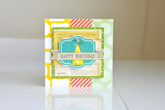
For the Birthday Boy by clouds85
I love this card so much that I don't even know where to start! The background is three different pieces of patterned paper upon which the designer layered and matted multiple tags. She used dimensional adhesive on more than one layer so that the sentiment literally pops off the card. It's absolutely gorgeous!
cards5
Happy Easter by Angelica Turner
Angelica's Easter card is just soft perfection! She stamped the images, the sentiment and even those tiny little eggs - and then colored them with markers and added small amounts of glitter. The ribbon and lace add the perfect finishing touches. I just adore this card. Angelica's attention to detail is fantastic!
Lotsa Happy Hellos by amcvey
Amy's card is so much fun and I love the way she used watercolor pencils here! She used a black background and stamped with black ink but the soft watercolor hues of blue and green just totally pop. This is a really cool idea for a card!
Smile & Be Happy by Leslie Ashe
I absolutely could not resist this card by Leslie Ashe! She used layers and layers of paper, cardboard shapes, stickers, die cuts, and buttons to create such a bright, cheerful card. It perfectly fits the sentiment expressed in this card! It's just gorgeous!
Hello There Spring by Leslie Ashe
And, oh my goodness, I had to feature a second card from Leslie this week because I just couldn't choose between two of my favorites. On this spring card, she again used a white background and layered paper, cardboard shapes, die-cuts, and then added twine as a finishing touch. She completely captured the feeling of spring with this card and these colors, and it is just perfect!
And there you have them - our gallery highlights! I love all of these and I really do wish we had time and space to feature more of the amazing designs out there. Thanks so much to all of the designers who shared their work with us this week. What were your favorite gallery layouts last week? Feel free to link us to them in the comments and let us know what you think and which are your current favorites in the galleries!
-Stephanie Vetne


