Inspired By: Subway Art
Inspiration comes in all forms. You never know where you might find it. Perhaps a color combination will inspire you. Or maybe a unique layout from your favorite designer will prompt you to pull out your own photos. As a visual learner, I regularly go on the hunt for inspiration. While browsing through Pinterest recently, I came across this subway art image and it gave me an idea for a some beach photos.
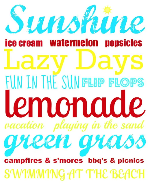
I found this summer subway art on a blog called Alderberry Hill. I was really drawn to the colors, the mix of fonts, the grouping of words and the overall message it conveys.
Using this piece as my inspiration, I set out to design my own subway art-inspired page element using Thickers from American Crafts.
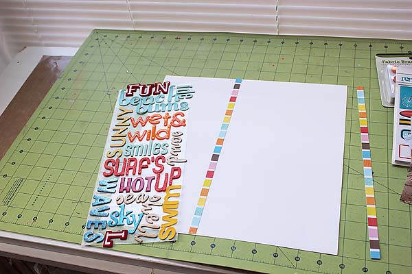
To start, I cut a piece of wax paper to fit over the section of cardstock that my Thickers would cover. I can arrange the words on the wax paper but the stickers will not permanently adhere to it. Once I have everything the way I want it, I can transfer the Thickers to my cardstock.
Before I started, I created a list full of beach themed words. I had a variety of longer and shorter words on my list. As I worked, I was able to pick and choose different words according to how much room I had and the size of the Thicker alphabet I was using. Starting at the top, I started to spell out the words in both vertical and horizontal orientations.
As I moved down the page, I ended up with a finite amount of space to work with. I had to rearrange a few words (this is where the wax paper comes in very handy) and added in a smaller scale alphabet to make sure I could utilize all of the space.
Here is the final subway art element that I will add to my page. I added a few extra letters that don't spell anything. "Lobster" was one of the words on my list. I didn't have enough room for the whole word but wanted to fill that last space with more red, so I just added the letter "L". Towards the top I didn't have enough room to add the whole word "tide" so I just added the letters that did fit, making sure that all of my available space was filled in.
Once I was happy with my arrangement, I started transferring the words over to my cardstock. Some of the older style Thickers have a tendency to lose their stickiness over time, so I used a liquid adhesive as I transferred some of the letters to make sure they wouldn't come off.
Here is my final layout. Because the word art makes such an impressive statement, I didn't feel that too many extra embellishments nor extensive journaling was needed. I just added a small cluster of stickers to the right, along with the date the photos were taken.
Supplies:
Cardstock: Bazzill canvas texture (White)
Patterned Paper: Echo Park Splash Big Stripes
Stickers: American Crafts Shoreline Flamingo Remarks Small Sticker Book
Adhesive: Ranger Glossy Accents, Scrapbook Adhesives Foam Squares
Brads: We R Memory Keepers Hall Pass Fabric Brads
Alphabets: American Crafts Thickers (Letterman - Red, Promenade - Orange Glitter, Chit Chat - Orange Puffy, Chit Chat - Yellow Vinyl, Prancer - Red, Muse - Woodgrain, Doll - Aqua, Poolside - Aqua, Iguana - Blue, Dazzle - Blue, Macaw - Yellow Glitter)
Not only is this a striking page element, but it's a great way to make a dent in your stash of Thickers! The idea could be adapted to fit any theme or season.
-Tammy Dailor


