Gallery Highlights | 2.22.2013
Welcome to another edition of gallery highlights! This week’s layouts are wonderful examples of how to use pattern and color to add energy and movement to a design. Let’s go take a look and I hope you like them all as much as I do. Don’t forget – you can click on the links to visit the layouts in their galleries and view supply lists, leave a comment for the designer, or view the designer’s other work.
Meeting Young House Love by jesshunt
I love this first layout for so many reasons but primarily because it has such a happy feel to it. The photos show happy, smiling faces and the way Jess has gathered all of them in the middle of the page and then layered fun and bright colors around the edges adds a lot of energy to the page. The little wood veneer shapes and arrow epoxy bring energy and movement to the layout, too. What a great, fun-filled photo collage!
h1
Pool Party by Fragola
Sandra's layout just screams fun from the banner down. She used such bright, summery colors layered over white cardstock that you can't help but feel the energy from this layout. Adding in dimensional embellishments and creative shapes are great touches, too.
Mittens by TaraElias
Tara's layout has a sad subject, but she has scrapped it beautifully. By layering papers and stitching into a directional embellishment on her page, she has created movement and energy throughout her page. Everything leads the eye to the photo and her heartfelt journaling, and that's the key to this very moving layout.
Ute by christin.gronnslett
Christin's layout has so many wonderful layers and embellishments that I don't even know where to start! It's a fairly neutral layout with small touches of bright yellow and teal and just one spot of bright red. She uses irregular borders, ripped papers, and little tidbits of embellishments to perfection here. All of these layers and details have the potential to overwhelm the single photo but her choice of shapes and color palettes instead draw the eye directly to the photo.
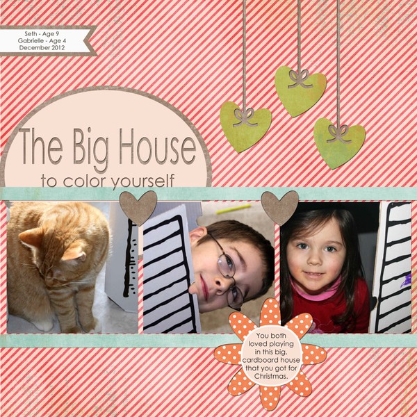
Big House by jmgesi
Jan's layout really caught my eye. I love that she wasn't afraid to use a very energetic background for these photos. She kept her shapes and layout design very simple, which is the key to using busy patterns. This is an excellent use of high-energy patterned paper.
The Big Day by lorybucaria
Lory's layout is simply stunning. I love the combination of kraft and white, and that doily stole my heart! She used a classic grid design for her photos and journaling spots. She added a lot of detail to all of her journaling tags but they don't overwhelm the layout at all because she kept so much consistent space open. It is a very happy, energetic wedding layout without being boring and overly formal.
And there you have them - our gallery highlights! I love all of these and I really do wish we had time and space to feature more of the amazing designs out there. Thanks so much to all of the designers who shared their work with us this week. What were your favorite gallery layouts last week? Feel free to link us to them in the comments and let us know what you think and which are your current favorites in the galleries!


