Gallery Highlights | 1.13.2013
Welcome to another edition of gallery highlights! The galleries are just bursting with fun, bright colors as we all celebrate the new year and I have some beautiful layouts and a stunning card for you to enjoy. Let’s go take a look at this week’s finds and I hope you like them all as much as I do. Don’t forget – you can click on the links to visit the layouts in their galleries and view supply lists, leave a comment for the designer, or view the designer’s other work.
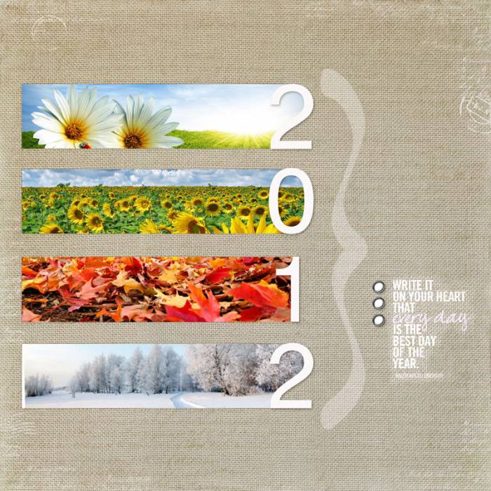
2012 Cover Page by anke
Anke is just finishing up her 2012 Project Life album and her cover page is simply gorgeous! She used 4 photos to represent the seasons and cropped them into thin rectangles that then blend into the date. She added a simple quote, an oversized bracket and some lightly textured brushes to finish it off and the result is simple and stunning!
gp1
Oh! Boy by adogslife 13
Tina's layout jumped right out of the gallery at me! It's fun, vibrant, and full of energy. She used beautiful, bright colors for both her accents and papers, and used arrows and directional embellishments to perfection. She continued the theme by placing her photos at an angle which creates energy and interest. I love everything about this layout!
Above the Clouds by smultringunn
Ingunn did a beautiful job including a lot of photos on this next layout! She made a photo collage of 6 photos and matted them on white cardstock which really helps the photos to pop. She layered the collage and cardstock on two different patterned papers and kept her embellishments super-simple - just a banner for the title and simple journaling. The result is gorgeous and sophisticated.
You are my everything by amypeterman
Amy designed this next layout for Fancy Pants Design with one of their new lines debuting at CHA this week. She used one of their new quote stencils as her title and the focal point of her layout. The soft colors and black-and-white photos really allow the title to shine. I'm excited to see more of this line and you can catch some sneak peeks on the Fancy Pants Designs blog.
I love you card by jbarksdale
Jennifer's card caught my eye immediately but I was even more excited when I saw that it was a hybrid card! She printed out digital papers and embellishments to create this beautiful, layered "I love you" card and the results couldn't be more gorgeous.
And there you have them - our gallery highlights! I love all of these and I really do wish we had time and space to feature more of the amazing designs out there. Thanks so much to all of the designers who shared their work with us this week. What were your favorite gallery layouts last week? Feel free to link us to them in the comments and let us know what you think and which are your current favorites in the galleries!
-Stephanie Vetne


