Gallery Highlights | 11.16.2012
Welcome to Gallery Highlights for this week!
This week’s finds include some beautiful layouts as well as some other gorgeous paper projects. Let’s go take a look at them and I hope you like them all as much as I do. Don’t forget – You can click on the links to visit the layouts in their galleries and view supply lists, leave a comment for the designer, or view the designer’s other work.
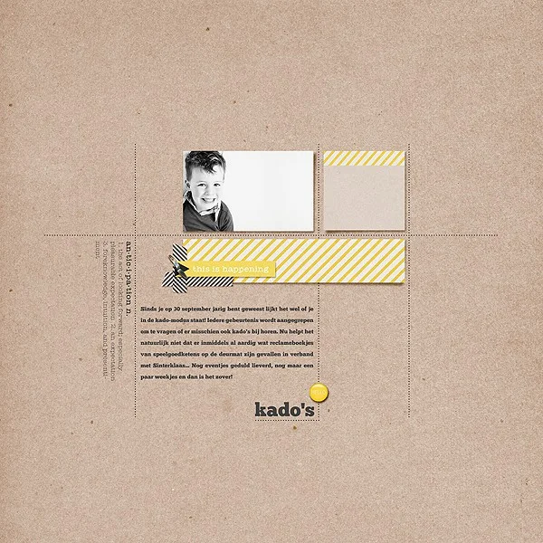
Anticipation by Jippo
If you are a fan of clean and simple scrapping, this layout will knock your socks off! With a piece of basic kraft paper as her background, the designer designed this page using a slightly asymmetrical grid. She included one black-and-white photo, two small pieces of paper with minimal embellishments and her text. She repeated the color yellow perfectly to create a visual triangle to help the eye move through the layout and the result is stunning!
Be You by justem
Emily's layout is so bright and colorful that I couldn't help but click on it to look at it more closely. She layered matted squares of photos and patterned paper with white cardstock borders over a bright yellow background, also matted on white cardstock. She allowed some of the squares to tilt to one side or the other and added adorable embellishment clusters to two of them. She then layered her die-cut title over the top of the squares. The consistent white borders allow the photos and the paper to pop off the page. It's an excellent design.
Dino Wins by mrsnosab
Barbara's layout captures a moment out of her child's playtime and does it so well. She included funny photos of the characters matted on multiple layers of cardstock and patterned paper. After centering them in the middle of the page, she added a thought bubble over the top, text above and below the photos and added just a few embellishments. What an adorable layout!
Sweet New Baby Wishes by Dani
Don't you just love this card? Danielle used a die-cut sheet of circles layered over white cardstock as her background. The combination creates an embossed look. On top of that, she layered stamped circles and a stamped sentiment - simple and beautiful.
Merry Christmas by waterytart
We're getting closer to the holidays and I love all of the holiday-themed cards I'm seeing pop up in all of the galleries. Sam's card really caught my eye. Her background is embossed white cardstock with a sentiment stamped on the top. Across the middle of the card, she attached three gorgeous poinsettias that she created with stamps and colored in with Copic markers. She added a bit of sparkle and shimmer to the flowers and attached them with brads. Gorgeous!
December Daily Album Cover by JenTapler
Speaking of the holidays, December Daily albums are starting to pop up all over the galleries, too, and Jen's is stunning! She painted a chevron-embossed album cover with white paint, added alphabet stickers across the top for the title and added just a few embellishments underneath. It is simple, sophisticated and full of holiday spirit.
And there you have them - our gallery highlights for the week! As I say every week, I really do wish we had time and space to feature more of the amazing designs out there. Thanks so much to all of the designers who shared their work with us this week. What were your favorite gallery layouts last week? Feel free to link us to them in the comments and let us know what you think and which are your current favorites in the galleries!
-Stephanie Vetne


