Gallery Highlights | 9.20.2012
Welcome to the latest edition of Gallery Highlights!
This week’s finds include some gorgeous layouts and a card that are sure to inspire you. I found some fantastic designs this week and I hope you like them all as much as I do. Let’s go take a look! Don’t forget – You can click on the links to visit the layouts in their galleries and view supply lists, leave a comment for the designer, or view the designer’s other work.
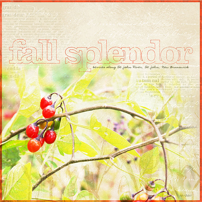
Fall Berries by grandma lynnie
Lynn's beautiful fall layout is the perfect example of the possibilities that are open with digital scrapping. She blended her photo with background paper and then blended text brushes onto the paper as well. Her large but light and airy title just adds to the perfection. The result is stunning.
Witch by SIFullerton
I have been a fan of Summer's work for years and this design is one of her best. She placed strips of paper on a diagonal on both sides of the page and added a black-and-white photo to the top left. This design is so eye-catching and very inspiring. Summer made this layout for Lily Bee Designs. You can see more Lily Bee layouts by clicking on their link or on Summer's blog - Summer Fullerton.
Oh Yes...I am most definitely spying on you by beehive50
I love what Debi has done with the circular embellishment on this next layout. She used a circular stamp as part of her title and even though the photo is small on this page, the large fun title makes you immediately want to look more closely at the photo. It's an excellent use of design as a tool to highlight a smaller photo.
Happy Birthday Card by Mendi Yoshikawa
Mendi's card made with Jillibean's Watermelon Gazpacho Soup collection immediately caught my eye. I love the rounded stitching around the border and I also really like the way her card title appears to hold the balloon strings in place. There's a lot of attention to detail on her card and the result is gorgeous.
Project Life Week 13 by Katie Pertiet
I have seen many, many Project Life pages this year and I love all of them. Katie's design, though, really struck me the minute I saw it. She used a grid format like many Project Life pages but she's only used a few photos on the page. She didn't try to fill up all of the spaces with photos and embellishments and journaling like most people do (including myself). She simply filled the other spaces with papers. The effect is beautiful and sophisticated and very inspiring.
And there you have them - our gallery highlights for the week! As I say every week, I really wish we had time and space to feature more of the amazing designs out there. Thanks so much to all of the designers who shared their work with us this week. What were your favorite gallery layouts last week? Feel free to link us to them in the comments and let us know what you think and which are your current favorites in the galleries!
-Stephanie Vetne


