Gallery Highlights | 4.26.2012
Welcome back to Gallery Highlights! This week's projects are so inspiring to me and I found a few new online galleries. Once again, I've found a mix of cards and layouts, both traditional and digital. So, let’s go take a look! You can click on the links to visit the layouts in their galleries and view supply lists, leave a comment for the designer, or view the designer’s other work.
When? by Jane_Bond7
Jane's layout stole my heart immediately. All I had to do was read the first line of her journaling and I was a goner. I adore the journaling. And the design and amazing blending just add to the fabulousness of it.

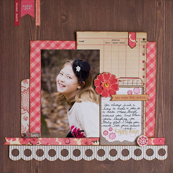
Cutie Pie by Kay Rogers
Kay has such a classic style and I love everything she does. This layout is no exception. The layered patterned papers really draw the eye to her daughter's photo, and I love the way she used the colors and the embellishments to balance the entire layout.

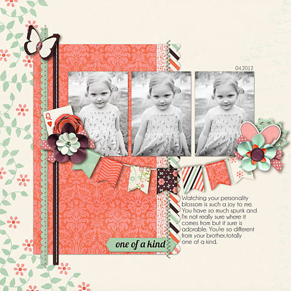
One of a Kind by NikkiARNGwife
This next layout is such a wonderful example of how to effectively use black and white photos. By backing them with a colorful palette and placing them right in the middle of the layout, your eye can't help but be drawn to the adorable photos! The banner under the photos is just the perfect embellishment to highlight them, too.

And there you have it – the gallery highlights for this week! Thanks so much to all of the designers who shared their work this week. What were your favorite gallery layouts this week? Feel free to link us to them in the comments!
-Stephanie Vetne
