Printing Digital Products: Which Paper To Choose?
Editor's Note: With this article, Stephanie Vetne makes her debut as a Contributing Writer at Scrapbook Update. We hope that you enjoy her expertise in digital scrapbooking. - Nancy
As a mostly digital scrapbooker, I am often asked about printing options for my layouts and digital supplies. People want to know how I print my layouts, and how to print digital supplies for use in hybrid projects. One of the most common questions I get is "which paper should I use?"
For layouts, the answer is easy - high-quality photo paper works best for printing. Photographs are usually the highlight of any layout, and photographs always look best on photo paper. My personal favorite is a matte or luster finish but I know plenty of other digital scrapbookers who prefer glossy paper. As long as it's photo paper, any of the finishes are just fine.
But when you're working on hybrid projects that use a combination of photographs, paper supplies, and digital supplies, you have a lot more options. I print all of my photographs on photo paper but I mix it up a lot more when I print digital supplies. Let me show you why other options work just as well for digital supplies.
Here I started with the journaling cards from Katie Pertiet's Labeled Journalers No. 4 from DesignerDigitals.com.
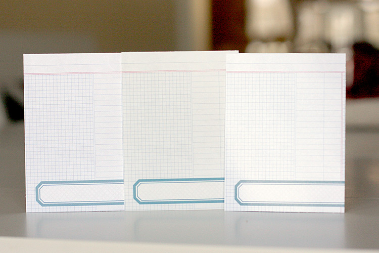
I chose one of the cards from Katie's kit and printed it off on three different types of paper.
In the photo above, the left card is printed on Bazzill Basics' White Orange Peel Cardstock, the middle card is printed on Epson Ultra Premium Photo Paper Luster, and the card on the right is printed on HP C6817A Professional Brochure & Flyer Paper. For 8.5" x 11" sheets, the Bazzill cardstock retails for $6.30/50 sheets, the Epson photo paper is $27.51/50 sheets, and the HP brochure paper is $10.79/50 sheets.
The cards don't look that different even though the papers are very different in texture, weight, and finish. The most noticeable difference is the gloss on the right card. The glossy finish is quite shiny and when you look at it straight on, it makes the card look a bit whiter and brighter. But it also makes the blues and the reds a tiny bit more washed out. If you look at the other two, the blues and reds appear a tad more saturated, with the cardstock just a bit lighter than the other two.
Here are the three cards from another angle.
(l-r: Cardstock, photo paper, brochure paper)
From this angle, the colors on the card printed on glossy brochure paper look more saturated and the sheen from the glare of looking at the card straight-on isn't as noticeable. The card printed on cardstock still looks a little bit lighter than the other two. But they all still look great - no smearing, no smudging - and the colors look very true, albeit a tiny bit different from each other. You can also see the thickness of the paper from this angle. The cardstock is the thickest of the three; the brochure paper is thinnest.
Now, let's look at them all individually.
The cardstock card looks great - the texture is visible, the colors are true, and there is no glare problem.
The luster card looks just as good as the cardstock card, although the colors are definitely a bit more saturated.
The brochure paper card again has the problem with glare, but is otherwise very similar to the other two cards.
So what paper's the best choice for printing off digital supplies? The answer is that any of these options works well. It all comes down to personal preference, which may include such considerations as price (the photo paper is almost three times as expensive as the other two), a preference for a matte finish, durability, and texture. In this case, I would probably choose the cardstock option even though the colors are less saturated because it's easier to write on cardstock than the other two surfaces.
But if I was printing off a different card - one that I wasn't planning to write on - I might choose one of the other options because I really like the color saturation on those two.
For example, here's another digital card I printed off on all three papers:
(l-r: Cardstock, photo paper, brochure paper)
This card I made myself by layering some of the word art from Cathy Zielske's Phrase Cards No. 01 over a piece of Katie Pertiet's digital patterned paper in her Blendable Photo Cards No. 03 kit. The color and saturation differences show up much more clearly on this card. The card printed on brochure paper is definitely darker than the other two. But again, all three cards look great and because I'm not using photographs and looking for accurate skin tones, this small amount of color variation is just fine. And the brochure paper is much less expensive than the photo paper so that's a big incentive for me to use it, too.
So the easy answer to the question of which paper is best to print digital supplies is that there is no right or wrong paper. You have a lot of options and they will all work well for most projects. Be brave, experiment with different papers to see what you like for different applications, and have fun adding digital supplies to your paper projects!


