Layout | Second Grade Changes
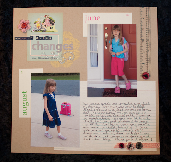
Another school year started today at our house. It’s hard to believe that my little girl is a big 3rd grader now! While she was on summer vacation the past couple weeks, I was reflecting back on how much she had changed during her 2nd grade year and decided to make a layout about it.
I normally don’t scrap a lot of school stuff for some reason (probably due to Bridget’s school experience being so different than normal because of her disability – I don’t have a ton of opportunities to take pictures in a school setting) but as she enters 3rd grade this week, I’m finally planning on taking the few school layouts that I’ve already done and making them the basis of a “school” album that I can build over the years for her. I figure it will be a good way to chart the basic process of her growth and development in a single album.
Since the photos didn’t have a lot of cohesive colors in them, taken on different days in different outfits, a neutral kraft background was perfect. Then a collage of embellishments was the perfect way to tie all the jumble of colors together into something resembling order (I like even my collage-y pages to feel orderly – kind of a contradiction, I know!).

Supplies – Patterned Paper: October Afternoon Farmhouse (Button Box), BasicGrey Basics (Blueline). Ink: Ranger Tim Holtz Distress (Antique Linen, Faded Jeans), Ranger Tim Holtz Distress Stain (Spun Sugar). Embossing Powder: Ranger (Clear Super Fine Detail). Rub-Ons: October Afternoon Thrift Shop (Image). Stamps: Tim Holtz for Stamper’s Anonymous (Seamless Experience). Alphabets: Cosmo Cricket Tiny Type (Blue), Sassafrass (Cool Gray). Embellishments: Elle’s Studio (Vintage Month Flashcards), BasicGrey (Out of Print Bloomers), Recollections (rhinestones), Making Memories (Sabrina Buttons), Hero Arts (Hero Hues Woven Lace Ribbon). Other: unknown buttons, DMC floss.
Journaling: Your second grade was stressful and full of change. First, there was your Daddy’s legal problems and last months at home. Then, “he went away” as you put it so sadly when we would talk. I worried so much about how you would handle it all, but you just continued to amaze us. At the start of the year you were a shy uncertain child, tentative. By June you carried yourself a whole new way: more mature, more confident. You made so much progress in your speech and other things! I’m so proud of you!
The title block is one of the trendy “button card” blocks that make up the back side of a patterned paper in October Afternoon’s upcoming new Farmhouse collection. It turned out to be a great way to “ground” the title block. I used buttons at three points in the layout to create a visual triangle and lead the eye through my design (I have a thing about doing that with embellishments). The notebook paper for the journaling, and the ruler, reinforces the school theme while also working with the collage style of the page. Most of the other embellishments are fairly random, chosen for size, shape and color, although the buttons do work well to pair with the theme of the button card in the title.
It was while trying to find a home in one of my albums for this layout that I decided that I think I will start a whole new school album for Bridget. I came across several other layouts that were from first days of school and couldn’t believe how much they showed stair steps of change in her life. So as soon as I get an album purchased, Bridget’s school years is going to be the first album in my new system of organizing my layouts, based on Stacy Julian’s Library of Memories system. Noell Hyman, my Paperclipping Roundtable co-host, posted a new Paperclipping episode today talking about doing the same thing with her albums!
