CHA Summer 2011 | Pink Paislee, Studio Calico, and We R Memory Keepers
Are you ready for another round of booth photos? I hope so, because today I have a roundup of Pink Paislee, Studio Calico, and We R Memory Keepers goodies to share with you!
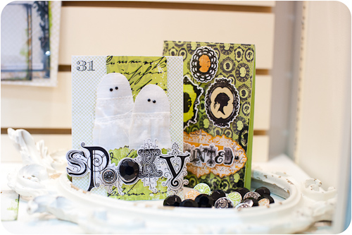
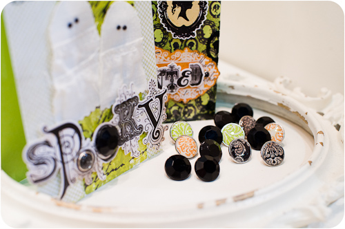
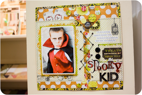
Pink Paislee debuted four stunning new lines at this CHA, including the rich patterns of the licensed House of 3 Halloween Line, “Phantom.” Many of the papers in this collection have a glossy raised embossing over the patterns, and the embellishments and clear stamps are a perfect match for the line.
Here are some gorgeous projects featuring Phantom, including a spooky selection of cards and layouts.
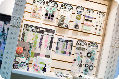
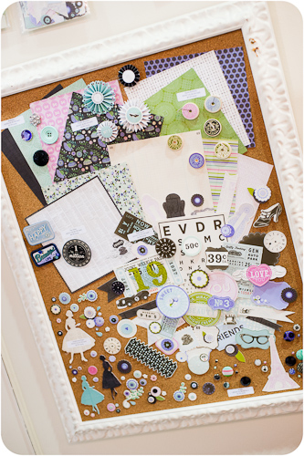
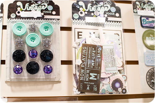
Pink Paislee's “Vintage Vogue” line is licensed from Collage Press, and contains one of the most unique color palettes of any line in the show - pink and green mixed with a sweet shade of cool purple.
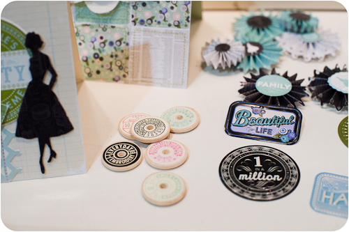
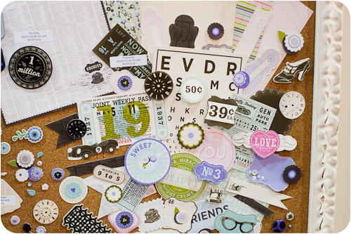
The line’s embellishments all fit with its retro theme, especially the tiny thread spool tops and crocheted trim. The die cut pack is reflective of a trend across almost all the manufacturers - packages of either die cuts or mixed ephemera that coordinate with the line and are available at a relatively low price point.
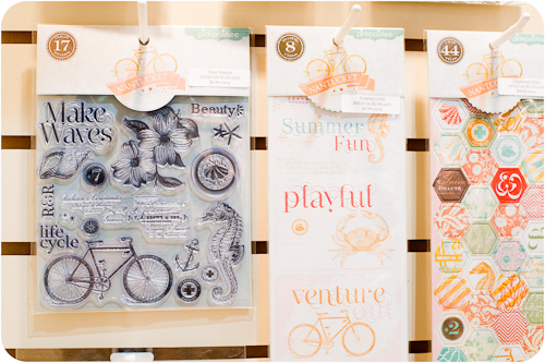
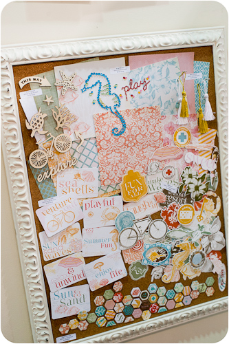
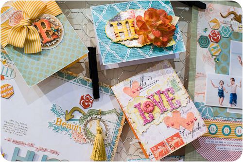
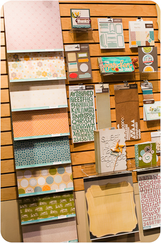
The very summer-y “Nantucket” line from Pink Paislee is an unusual - though certainly not unwelcome - release as the summer CHA show is usually full of Halloween, Fall, Winter, and Christmas lines. The breezy patterns and strong pastel color palette made this line a definite standout of the show.
The line's embellishments certainly don’t disappoint, and I believe this is the first time I’ve seen stickers available in that cute hexagonal shape.
Wood shapes are also a hot item at CHA Summer 2011.
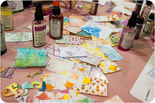
The “Mistables” line follows on the success of Pink Paislee’s CHA Winter 2010 “Parisian Anthology” release. These papers have the same style of embossed “resist” areas as “Parisian Anthology” but in a whole new set of patterns. Pink Paislee has also beefed up the thickness of the paper to help prevent it from warping or bleeding when wet.
They’ve also introduced a whole new line of mistable embellishments, such as trims.
The staff at Scrapbook Update had the chance to play with some samples of the "Mistables" paper while at the Pink Paislee booth, and it took color beautifully and blended well without warping, even after several spray coats.
Pink Paislee’s design team did a wonderful job on booth samples, showing how all of the lines could be blended with “Mistables” items.
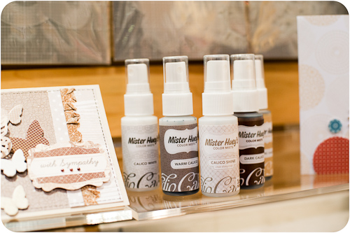
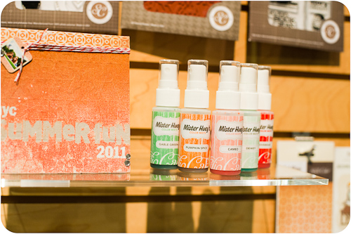
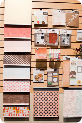
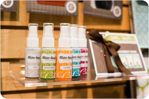
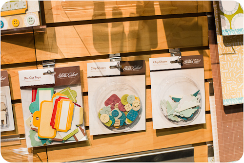
The next stop on today’s tour is perennial favorite Studio Calico. Their new “Calico Basics” line generated a lot of buzz on the show floor! They’ve also added “Calico Shine” to their basic Mister Huey line for those who want a little shimmer on their projects.
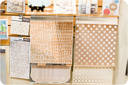
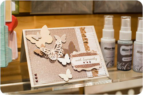
The “Calico Basics” line takes Studio Calico’s signature graphic style and interprets it in kraft paper to create a line that will work with almost any of their other releases both past and present.
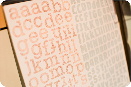
I predict that these kraft letter stickers are going to be a hot item!!
Studio Calico has also designed a line of masks sporting several of their most popular motifs.
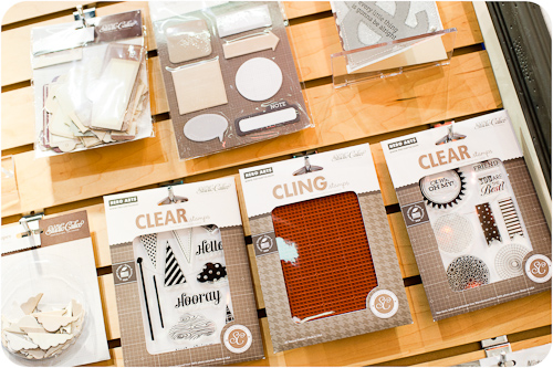
Are those the new Hero Arts stamps that I spy?
And how awesome is this paper? Woodgrain is another huge trend in the industry right now.
“Autumn Press” is Studio Calico’s fall release and comes complete with its own shades of Mister Huey.
A few of the papers have definite fall motifs, but the majority are generic enough to be used for almost any project- even the themed papers have a more graphic “B” side.
And, there's more new stamps!
Another hot trend this summer? Map paper is hot, and not just in travel lines!!
Even these “Autumn Press” alphabet stickers sport a map print.
Studio Calico’s third CHA Summer 2011 release, “Memoir”, has a much darker color palette than “Autumn Press” and has more of a vintage farmhouse vibe to it. There’s even a pattern or two reminiscent of homemade quilts, bringing the whole sewing theme that was so popular at CHA a year ago back into the mix.
In this shot you’ll see something else that’s completely new for Studio Calico this show - 6x6 paper pads!!
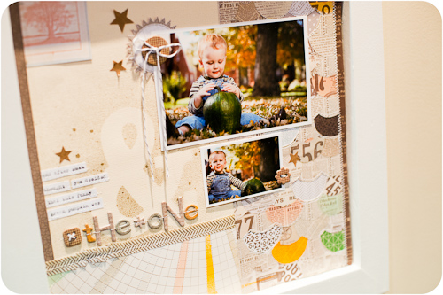
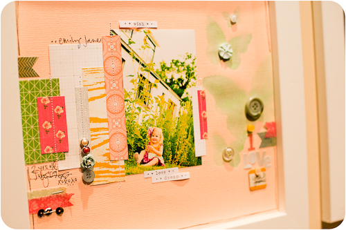
As usual, Studio Calico’s design team knocked it out of the park when it came to booth samples.
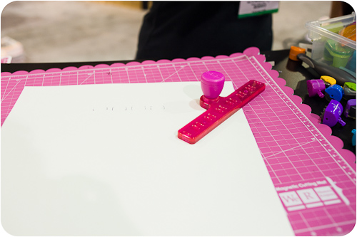
Our last stop for this post is the ever-colorful We R Memory Keepers booth. They debuted a new tool at the show - the "Sew Ribbon", a follow-up to the "Sew Easy" tool. As you can probably guess, it helps you stitch ribbon on your projects in a variety of patterns.
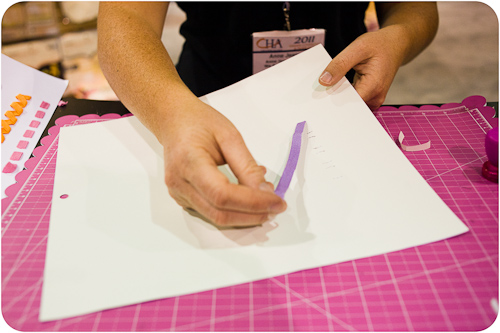
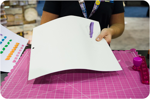
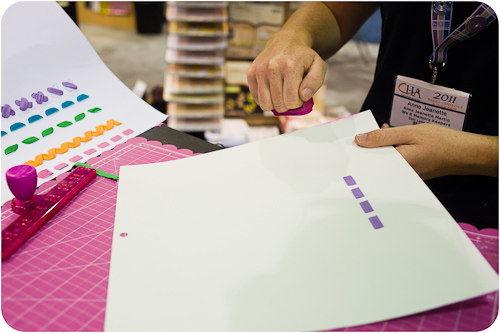
The We R Memory Keepers booth staff was kind enough to demo the Sew Ribbon for us, starting with using the template and included cutter to punch holes in the paper.
A reusable, self-adhesive set of "ribbon needles" are included with each set and is used to help guide the ribbon through the holes as you "stitch."
We R Memory Keepers is also debuting a new line of distress inks. The "Sweetheart"-shaped inkers feature a unique grip to help control the ink pad during use.
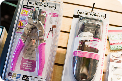
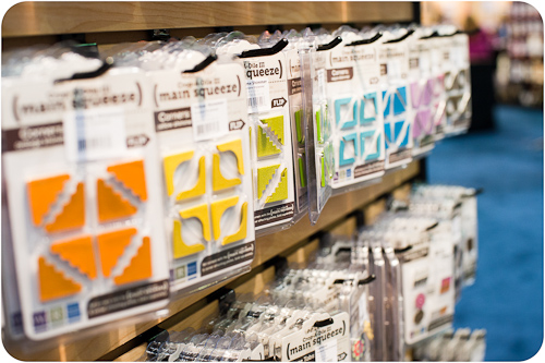
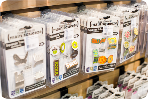
The Crop-A-Dile 3 is a corner and tab setter, and We R Memory Keepers has a huge variety of colors and styles of the embellishments available.
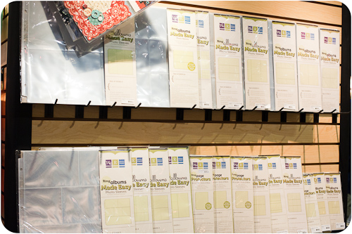
These aren’t new, but I just had to include their immensely popular - and extensive - selection of divided page protectors.
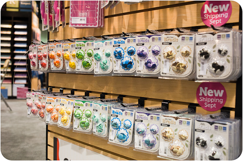
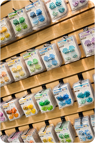
We R Memory Keepers is getting back to basics with a huge range of brads and eyelets that will be available later in the fall.
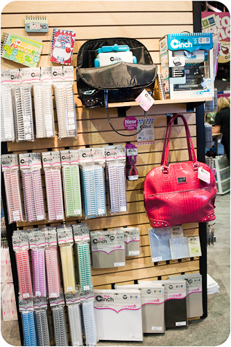
The Cinch 2 is also not new for this show, but I couldn’t help but include a shot of that lovely rainbow of binding rings!
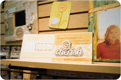
While We R has a fantastic range of new tools (actually more of them than are even covered here), their paper lines also really shine for this release and I wanted to make sure they got a bit of the spotlight as well.
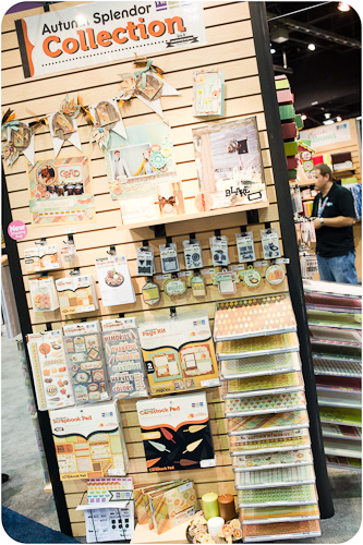
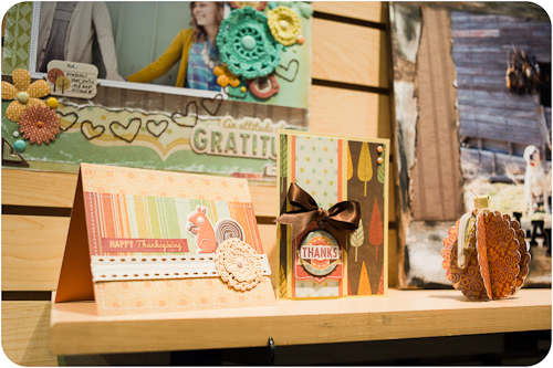
The “Autumn Splendor” collection has a lovely, soft fall palette and plenty of coordinating stamps and embellishments.
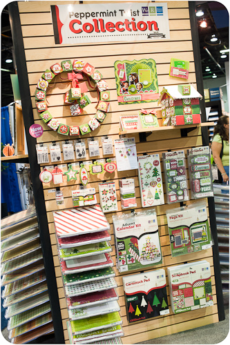
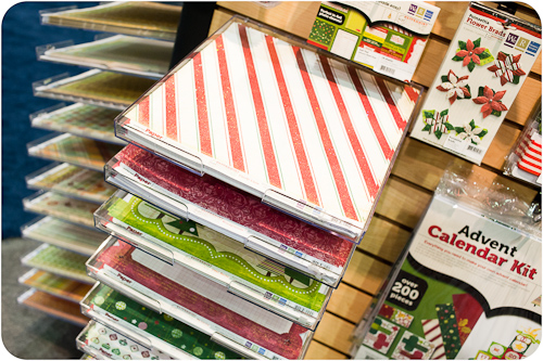
“Peppermint Twist,” We R Memory Keepers’ Christmas line, puts a cute, funky spin on a traditional color palette.
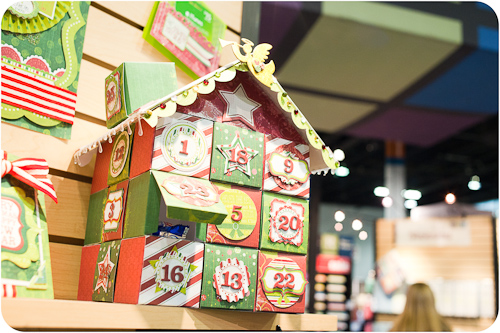
The line also includes an advent calendar kit. (We saw many advent calendars all over the show floor).
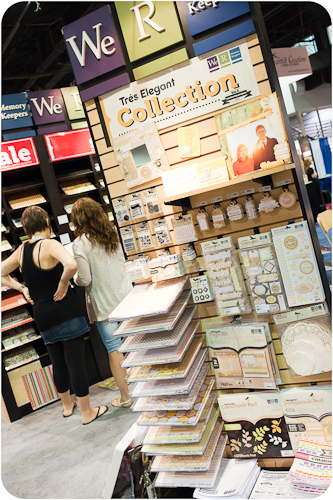
“Tres Elegant” would be lovely for wedding photos.
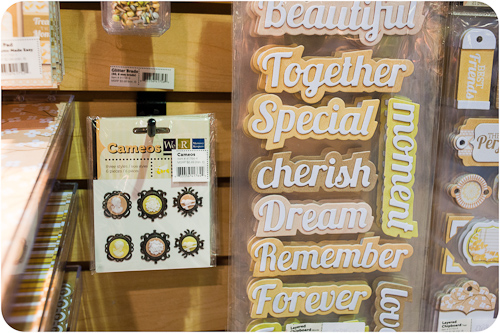
And I spy a set of cameos here! This is a trend that’s continued from the last several CHA shows.
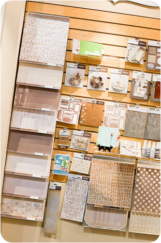
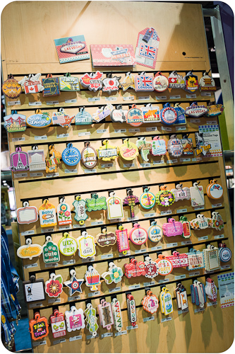
I’ll round off the tour with this fantastic wall of die cuts. I told you die cuts were hot! You’ll be seeing a lot more of them as Scrapbook Update continues to post booth photos.
So did you see anything you like? Did anything in particular jump out at you? Leave a comment and let us know! We’ll be back later with lots more coverage from the show floor!
